Filterable Row Styles in AG Grid
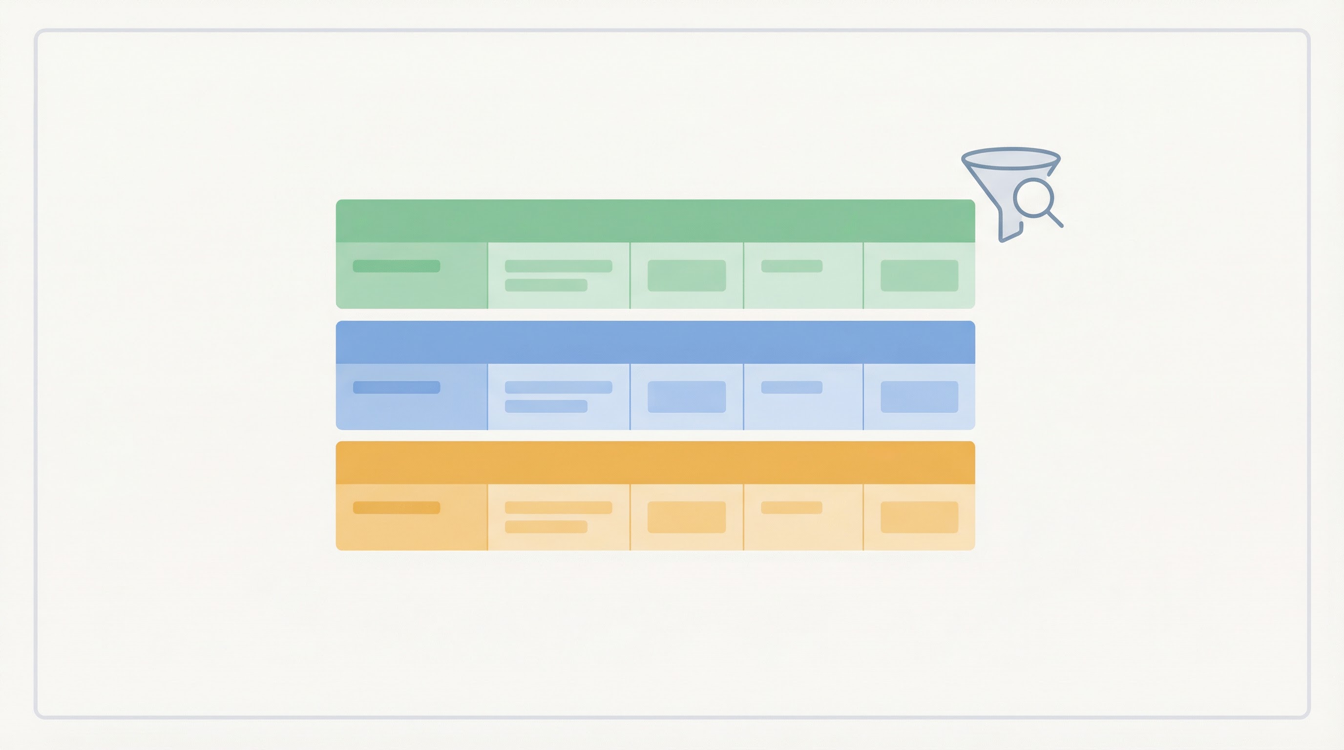
Showing how to use Named Queries to create full-row Conditional Styles. We also provide custom Dashboard Buttons and Menu Items to easily filter them using the Grid Filter
Feedback
- This Blog post, and accompanying demo, was inspired by an AdapTable Help Ticket
- If you have an AdapTable or AG Grid use case that you are struggling to meet, please contact us
Request
We were recently contacted by an AdapTable user with an interesting request.
She asked how she could achieve the following 2-step process in AG Grid:
-
enable run-time users to create full-row styles (using a custom Rule)
-
provide these users with a way of easily filtering the Grid using the created styles
Solution
AdapTable makes this possible by using a combination of UI components and functionalities:
- Named Queries - wrap AdapTableQL Expressions and are fully reusable
- Grid Filter - a multi-condition, cross-column filtering module
- Conditional Styles - formats and styles which render based on a custom rule
- Custom Column Menu and Context Menu Items - that users add to the AG Grid menus
- Custom Toolbar which displays Custom Adaptable Buttons
- Adaptable API for run-time access to all AdapTable functionality
Demo Example
We created a small demo for our user illustrating to her how the solution works.
Important
The demo uses only existing AdapTable functionality, UI components and API methods
Named Queries
The key is to leverage Named Queries, a powerful, and often under-used, AdapTable feature. As the name implies, Named Queries are simply named AdapTableQL Boolean Expressions.
Note
By giving the Query a Name, it can easily be shared and re-used in multiple modules (see below)
In our example we create 3 Named Queries, each of which groups a set of Frameworks.
Hint
The Named Queries Expressions use the AdapTableQL IN Expression Function
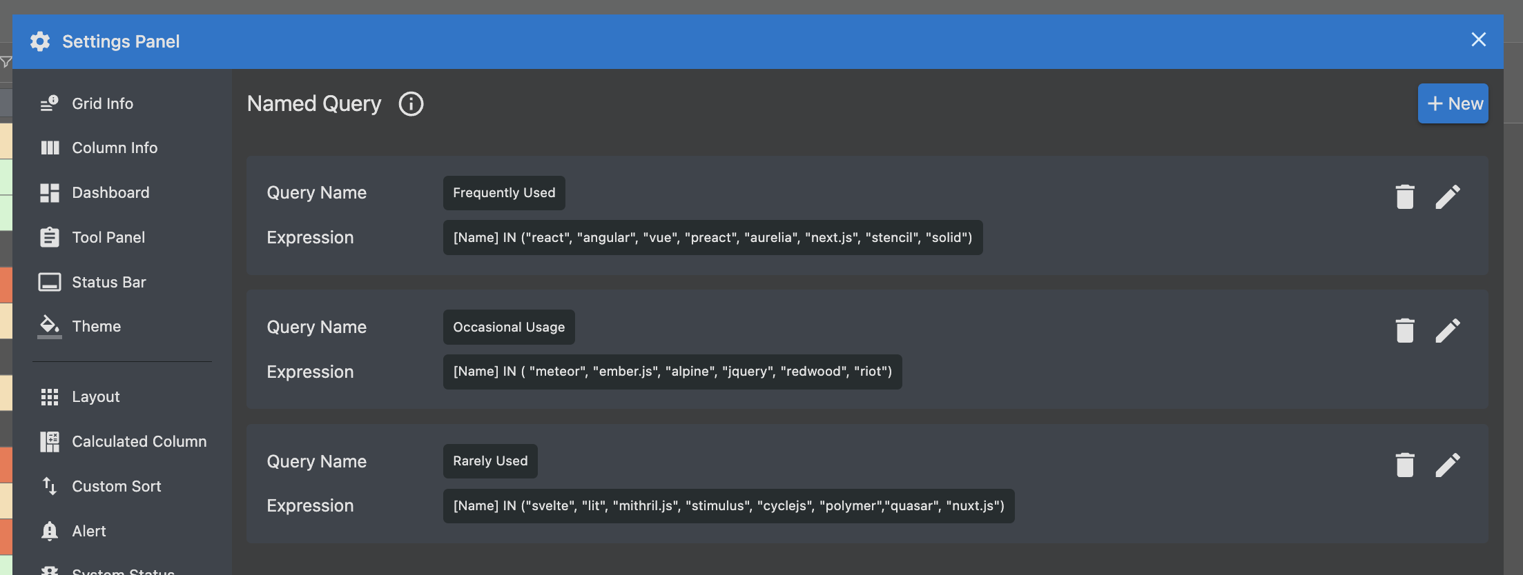
 NamedQuery: {
    NamedQueries: [
    {
        Name: 'Frequently Used',
        BooleanExpression: '[name] IN ("react", "angular", "vue", "preact", "aurelia", "next.js", "stencil", "solid")',
    },
    {
        Name: 'Occasional Usage',
        BooleanExpression: '[name] IN ( "meteor", "ember.js",  "alpine", "jquery", "redwood", "riot")',
    },
    {
        Name: 'Rarely Used',
        BooleanExpression: '[name] IN ("svelte", "lit",  "mithril.js", "stimulus", "cyclejs", "polymer","quasar", "nuxt.js")',
    }],
},
We then re-use each Named Query in a number of ways.
Conditional Styles
We configure a separate full-row Conditional Style for each Named Query. Each Conditional Style Rule wraps a different Named Query and provides a distinct style.
Hint
- The Conditional Style expressions themselves are very straightforward
- They simply leverage the AdaptableQL QUERY expression function which wraps a Named Query
Rule: {
    BooleanExpression: 'QUERY("Frequently Used")',
},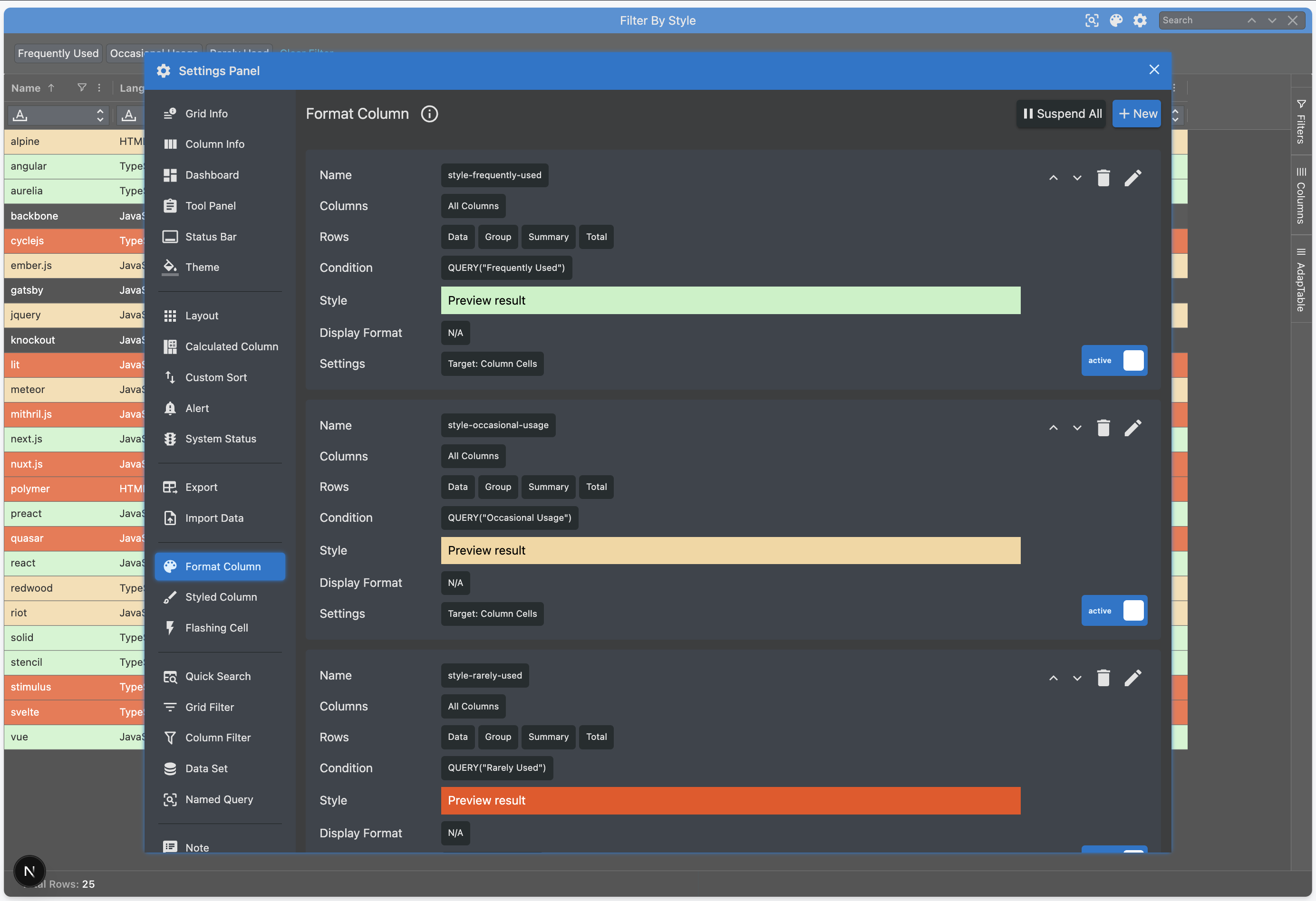
FormatColumn: {
    FormatColumns: [
    {
        Name: 'style-frequently-used',
        Scope: {All: true},
        Rule: { BooleanExpression: 'QUERY("Frequently Used")', },
        Style: { ForeColor: 'Black', BackColor: 'rgb(196, 242,196)' },
    },
    {
        Name: 'style-occasional-usage',
        Scope: {All: true},
        Rule: { BooleanExpression: 'QUERY("Occasional Usage")',},
        Style: { ForeColor: 'Black', BackColor: 'rgb(245, 214,158)' },
    },
    {
        Name: 'style-rarely-used',
        Scope: {All: true},
        Rule: { BooleanExpression: 'QUERY("Rarely Used")',},
        Style: { ForeColor: 'White', BackColor: 'rgb(240, 79,20)' },
    }],
},
UI Components
Next we leverage 3 of the UI components provided by AdapTable.
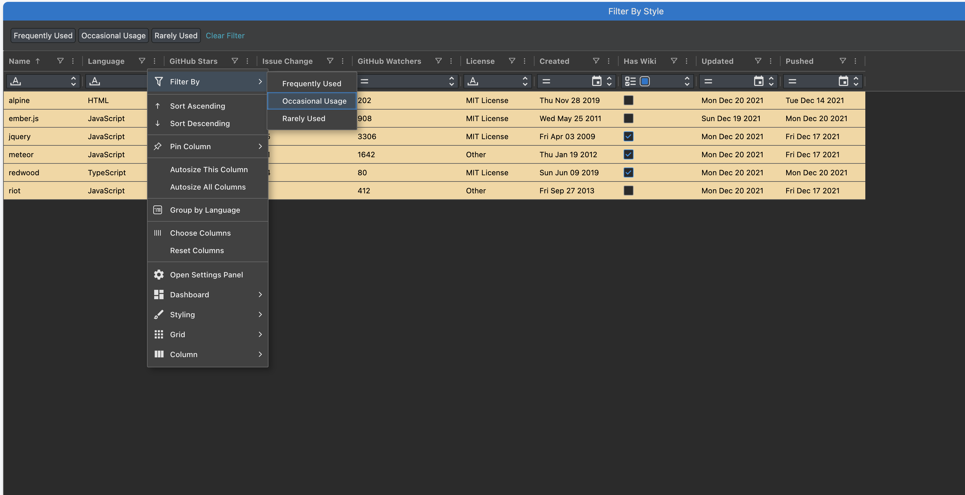
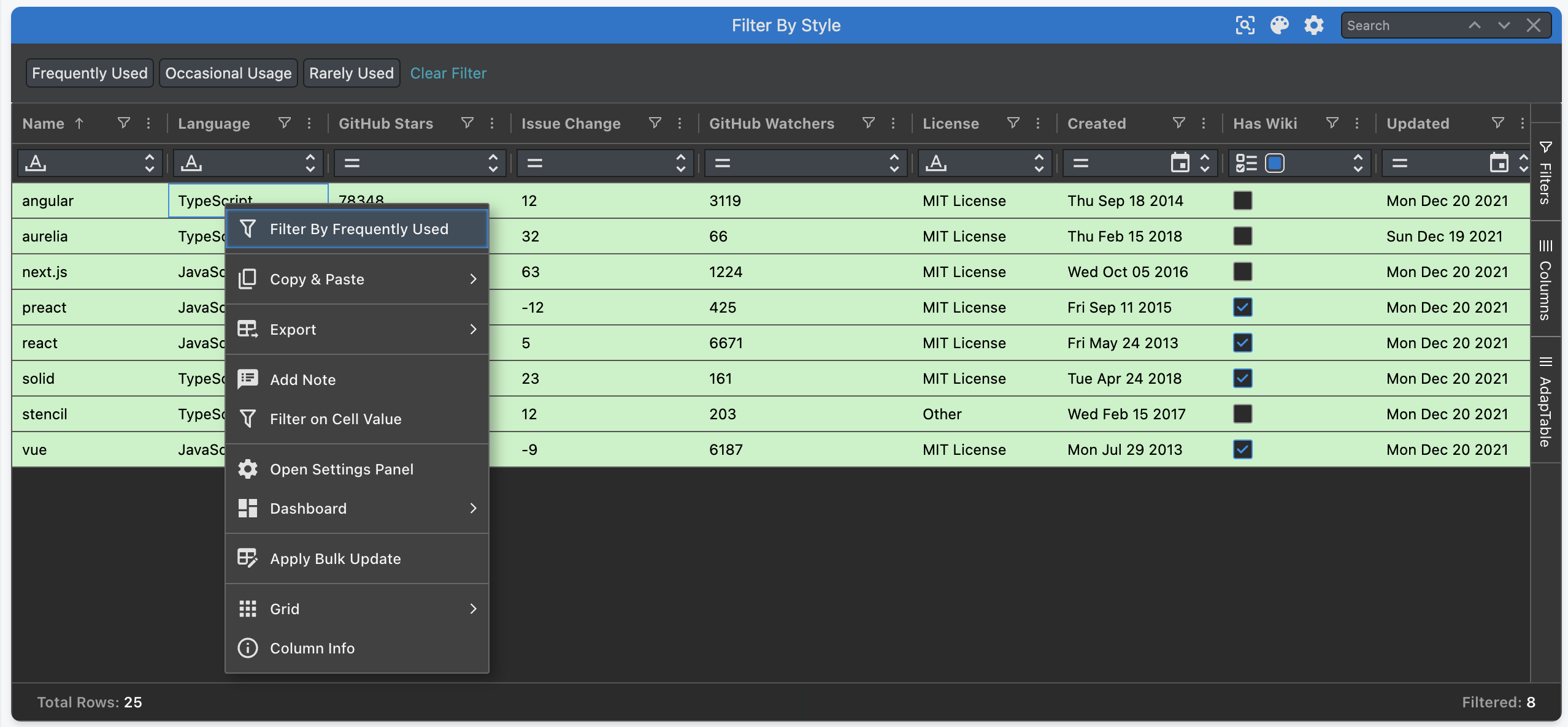
Column Menu
We provide a Custom Column Menu Item in each Column Menu. The Menu Item lists all the Named Queries, as sub menu items, and then filters the Grid using the value selected.
columnMenuOptions: {
customColumnMenu: (context: CustomColumnMenuContext) => {
    const { defaultAgGridMenuStructure, defaultAdaptableMenuStructure, adaptableApi } = context;
    const queries = adaptableApi.namedQueryApi.getNamedQueries();
    const submMenuItems: UserColumnMenuItem[] = [];
    queries.forEach((query: NamedQuery) => {
        const subMenuItem: UserColumnMenuItem = {
            menuType: 'User',
            label: query.Name,
            onClick:()=> adaptableApi.filterApi.gridFilterApi.setGridFilterExpressionUsingNamedQuery(query),
        };
        submMenuItems.push(subMenuItem);
    });
    const filterByStyleMenuItem: UserColumnMenuItem = {
        menuType: 'User',
        label: 'Filter By',
        icon: { name: 'filter' },
        subMenuItems: submMenuItems,
    };
    return [
        filterByStyleMenuItem,
        '-',
        ...defaultAgGridMenuStructure,
        '-',
        ...defaultAdaptableMenuStructure,
    ];
}},
Context Menu
We also provide a Custom Context Menu Item in each Grid Cell. The Context Menu Item works out which Named Query is associated with that Grid Cell's row. When the menu item is selected, it filters the Grid by that Named Query.
contextMenuOptions: {
customContextMenu: (context: CustomContextMenuContext) => {
const { defaultAgGridMenuStructure, defaultAdaptableMenuStructure, adaptableApi } = context;
let framework: string = context.rowNode.data['name'];
const query = adaptableApi.namedQueryApi.getNamedQueries()
.find((nq: NamedQuery) => nq.BooleanExpression.includes(framework));
const filterByStyleMenuItem: UserContextMenuItem = {
menuType: 'User',
label: 'Filter By ' + foundQuery?.Name,
icon: { name: 'filter' },
onClick:()=>adaptableApi.filterApi.gridFilterApi.setGridFilterExpressionUsingNamedQuery(query)
};
return [
filterByStyleMenuItem,
'-',
...defaultAgGridMenuStructure,
'-',
...defaultAdaptableMenuStructure,
];
},
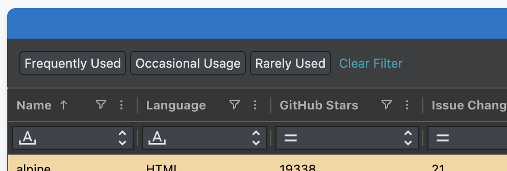
},Dashboard Toolbars and Buttons
Finally, we create a Custom Toolbar to display in the Dashboard.
dashboardOptions: {
    customToolbars: [
      {
        name: 'filter_buttons',
        title: 'Filter Buttons',
      },
    ],
  },
We dynamically render an Adaptable Button for each Named Query.
When the Button is clicked, we filter the Grid by that Named Query.
We also provide a Clear Filter Button to remove any filtering.
Important
- Because we want to create the Buttons dynamically we don't configure them in Dashboard Options
- Instead we create them on the fly by subscribing to 2 of the most frequently used Adaptable Events:
- Adaptable Ready - to create the buttons when AdapTable initialises for the first time
- Adaptable State Changed - to recreate if Format Columns or Named Queries change in State
export function createToolbarButtons(adaptableApi: AdaptableApi) {
  const gridFilterApi: GridFilterApi = adaptableApi.filterApi.gridFilterApi;
  const toolbar = adaptableApi.dashboardApi.getCustomToolbarByName('filter_buttons');
  const queries = adaptableApi.namedQueryApi.getNamedQueries();
  const buttons: AdaptableButton<CustomToolbarButtonContext>[] = [];
  queries.forEach((query: NamedQuery) => {
    const button: AdaptableButton<CustomToolbarButtonContext> = {
      label: query.Name,
      onClick: () => { gridFilterApi.setGridFilterExpressionUsingNamedQuery(query) },
    };
    buttons.push(button);
  });
  const clearFilterButton: AdaptableButton<CustomToolbarButtonContext> = {
    label: 'Clear Filter',
    buttonStyle: { tone: 'info', variant: 'text' },
    onClick: () => { gridFilterApi.clearGridFilter() }
  };
  buttons.push(clearFilterButton);
  toolbar.toolbarButtons = buttons;
  adaptableApi.dashboardApi.refreshDashboard();
}
export const onAdaptableReady = ({adaptableApi}: AdaptableReadyInfo) => {
  createToolbarButtons(adaptableApi);
  adaptableApi.eventApi.on( 'AdaptableStateChanged', (stateChangedInfo: AdaptableStateChangedInfo) => {
      const actionType = stateChangedInfo.action.type;
      if (actionType.includes('FORMAT_COLUMN') || actionType.includes('NAMED_QUERY')) {
        adaptableApi.filterApi.gridFilterApi.reApplyGridFilter();
        createToolbarButtons(adaptableApi);
        adaptableApi.gridApi.refreshRowNodes();
      }
    }
  );
};
Grid Filter
The last element in our demo is the Grid Filter - a powerful, cross-column filtering module.
Note
The Grid Filter runs in parallel with Column Filters, enabling the richest DataGrid functionality available
At its heart, the Grid Filter is an intuitive wrapper around an AdapTableQL Boolean Expression.
This makes it trivial to filter the Grid using our Named Queries.
Each time the user selects a custom Menu Option, or clicks a Dashboard Button, the onClick functions simply create, and set, a new Grid Filter Expression dynamically.
Hint
We leverage the useful setGridFilterExpressionUsingNamedQuery function in Grid Filter Api:
gridFilterApi.setGridFilterExpressionUsingNamedQuery(query);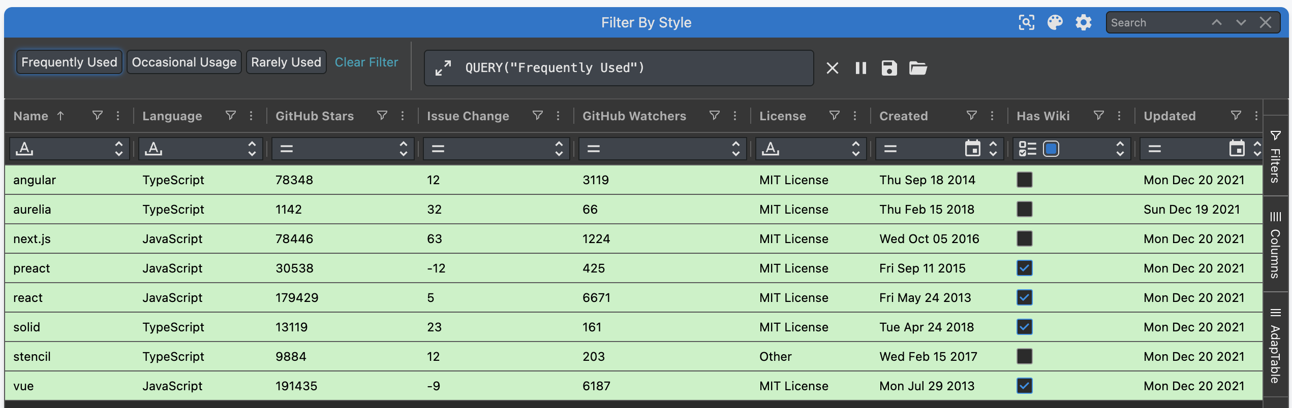
Extensibility
As noted above, we create, and display the Dashboard Buttons dynamically.
This provides our demo with one big advantage: each time we create a new Format Column which wraps a Named Query, a new Dashboard button will automatically appear.
Note
- In our demo we deliberately leave 3 Frameworks without a Name:
backbone,gatsby&knockout - Below we create a new Named Query, and associated Style, and a new Button dynamically appears