Editing Data in AdapTable

AdapTable offers a wealth of features and functionalities designed to enable quick, safe and audited data entry; this blog post describes a demo app that contains many of these.
AdapTable boasts a wealth of features that facilitate swift, safe and audited data entry.
These provide our users with significant competitive advantage, helping them to edit data faster, more intuitively and more accurately than their competitors.
This blog post provides a small demo (built using the vanilla/TypeScript version of AdapTable) which contains many of the editing-related functionalities provided in AdapTable including:
Important
The demo uses only existing AdapTable functionality, UI components and API methods
| Functionality | Details |
|---|---|
| Smart Edit | Edits multiple numeric cells using single operation |
| Bulk Update | Updates many cells to same value |
| Shortcut | Sets mathematical operations when shortcut key is clicked |
| Plus Minus | "Nudge Rules" for when + or - are pressed on the keyboard |
| Cell Editors | Specialist Editors - Select, Percent, Numeric & Date Picker |
| Action Column | Special columns containing buttons (which can be used when editing) |
| Row Forms | Special forms designed for bespoke row editing (and creating) |
| Cell Editability | Configure which cells can be edited |
| Editable Cell Styling | Custom style Editable, ReadOnly and Edited Cells |
| Data Validation | Validate data entry (on both Client and Server) |
| Change History | Full recorded history of all data edits |
Note
- We have enabled Flashing Cells in this demo to make it easier to see which Cells are being edited
- Additionally we have provided Styles for Editable Cells and Edited Cells (see below for more details)
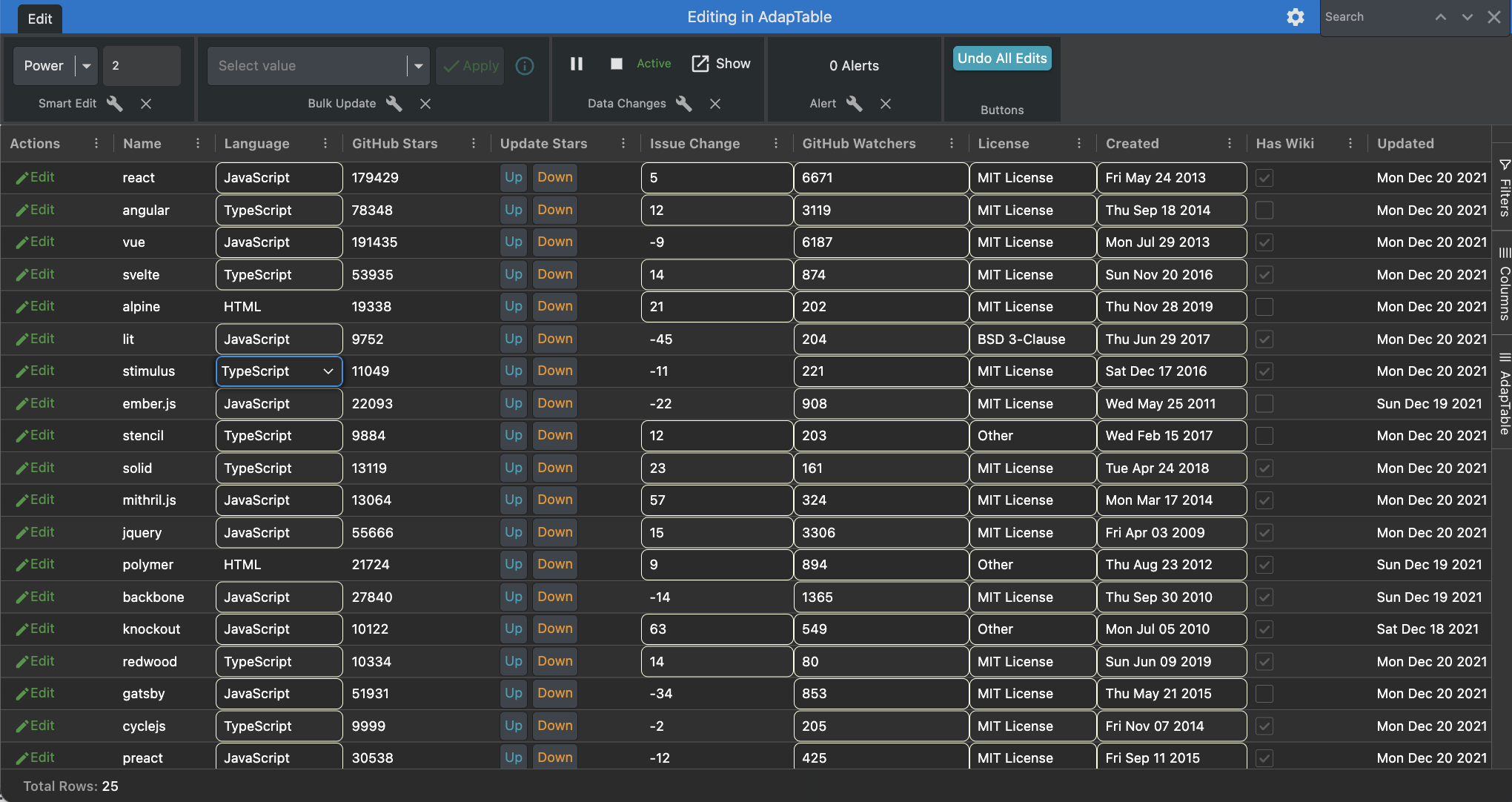
Smart Edit
The Smart Edit module allows users to apply a single edit to multiple, numeric cells, using one of the 4 mathematical Smart Edit Operations supplied by AdapTable:
- Addition
- Subtraction
- Multiplication
- Division
In addition developers are able to provide Custom Smart Edit Operations if required.
We do that in this demo by providing a Power operation:
editOptions: {
  smartEditCustomOperations: [
  {
    name: 'Power',
    operation: (context: SmartEditOperationContext) => {
      return Math.pow(context.currentCell.rawValue, context.smartEditValue);
    },
  }],
}
We leverage the Adaptable Ready Event - which fires when AdapTable has initialised - to make Power the current operation and to set the smart edit value to 2:
export const onAdaptableReady = ({adaptableApi}: AdaptableReadyInfo) => {
  adaptableApi.smartEditApi.setCustomSmartEditOperation('Power');
  adaptableApi.smartEditApi.setSmartEditValue(2);
};
Bulk Update
AdapTable also provides a Bulk Update module which facilitates updating multiple cells in a column to the same value in a single step.
Note
- Bullk Update controls display a dropdown listing all distinct column values to facilitate quick editing
- Alternatively, run-time users can update the cells to a new value (which is not currently in the Grid)
Shortcut
Another data entry Module provided by AdapTable is Shortcuts.
Hint
Shortcuts help to avoid "fat finger" issues by providing an easy way to accurately edit numeric data
A Shortcut consists of an alphabet keystroke which when entered into a numeric cell automatically converts into a mathemetical operation using the existing cell contents.
In our Demo we added a Shortcut of 'K' multiplying values in Github Watchers column by 1000:
Shortcut: {
  Shortcuts: [
    {
      Name: 'shortcut-K-multiply-1000',
      Scope: { ColumnIds: ['github_watchers'] },
      ShortcutKey: 'K',
      ShortcutOperation: 'Multiply',
      ShortcutValue: 1000,
    }],
},
Plus Minus
The Plus Minus module is used to update numeric cells, this time in response to keyboard input:
- the
plus(+) keyboard key causes an increment of the cell's value - the
minus(-) keyboard key causes a decrement of the cell's value
Hint
This is ideal for situations where data needs to be edited incredibly quickly (e.g. if marking to market)
It is possible to provide a Nudge Condition, so the Plus / Minus only operates if the rule's evaluation returns true.
In our demo we have applied 2 Plus Minus Nudge Rules, both to the Github Watchers column:
- Increase / Decrease by 10 if the
Languageis TypeScript - this rule will get evaluated first - Increase / Decrease by 2 - this rule will get evaluated only if rule above returns false
PlusMinus: {
  PlusMinusNudges: [
    {
      Name: 'plusMinus-github_watchers-TypeScript',
      Scope: { ColumnIds: ['github_watchers'] },
      Rule: { BooleanExpression: '[language] = "TypeScript"' },
      NudgeValue: 10,
    },
    {
      Name: 'plusMinus-github_watchers-Normal',
      Scope: { ColumnIds: ['github_watchers'] },
      NudgeValue: 2,
    }],
},
Action Column
The functionality we provided in the Plus Minus rules can also be achieved using Action Columns.
Action Columns are special columns which display a Button(s) with a user-defined action.
Hint
- The buttons in the Action Column can do anything and are not limited to editing
- However, a frequent Action Column use case is to edit a cell in an adjacent Column
Our demo contains an Update Stars Action Column which contains 2 Up and Down buttons that update the Github Stars column (using similar rules as provided for Plus Minus Nudges above).
actionColumnOptions: {
  actionColumns: [
    {
      columnId: 'update_stars',
      friendlyName: 'Update Stars',
      actionColumnButton: [
        {
          label: 'Up',
          buttonStyle: { variant: 'outlined', tone: 'info' },
          onClick: (button: ActionColumnButton<ActionColumnContext>, context: ActionColumnContext) => {
            const rowData: WebFramework = context.rowNode?.data;
            const increment = rowData.language == 'TypeScript' ? 10 : 2;
            const cellUpdateRequest: CellUpdateRequest = {
              columnId: 'github_stars',
              newValue: rowData.github_stars + increment,
              primaryKeyValue: context.primaryKeyValue,
              rowNode: context.rowNode,
            };
            context.adaptableApi.gridApi.setCellValue(cellUpdateRequest);
          },
        },
        {
          label: 'Down',
          buttonStyle: { variant: 'outlined', tone: 'warning' },
          onClick: ( button: ActionColumnButton<ActionColumnContext>, context: ActionColumnContext) => {
            const rowData: WebFramework = context.rowNode?.data;
            const decrement = rowData.language == 'TypeScript' ? 10 : 2;
            const cellUpdateRequest: CellUpdateRequest = {
              columnId: 'github_stars',
              newValue: rowData.github_stars - decrement,
              primaryKeyValue: context.primaryKeyValue,
              rowNode: context.rowNode,
            };
            context.adaptableApi.gridApi.setCellValue(cellUpdateRequest);
          },
        }],
    },],
},
Cell Editors
AdapTable provides 4 Cell Editors so that data can can be quickly and safely entered into AG Grid:
| Editor | Which Columns | When Used |
|---|---|---|
| Select (Dropdown) Editor | All | If configured in EditOptions |
| Numeric Cell Editor | Numeric | Always |
| Date Picker | Date | Always |
| Percentage Cell Editor | Numeric | With % Rendering |
In the demo we display the Select Editor when editing the Language and License columns:
editOptions: {
  showSelectCellEditor: context => {
    return (context.column.columnId === 'language' || context.column.columnId === 'license');
  },
}
Note
The Numeric Cell Editor and Date Picker are also available in the demo as they are the default editors
Custom Edit Values
By default the Select Editor will display all the distinct values in the Column, and the run-time user simply needs to select the required value from the list that automatically appears.
However it is possible to provide a custom set of values to display in the select editor if required.
In the demo we provide extra options to display in the Language Column's Select Editor:
editOptions: {
  customEditColumnValues: (customEditColumnValuesContext: CustomEditColumnValuesContext) => {
      if (customEditColumnValuesContext.column.columnId === "language") {
        const extraValues = [
          { label: "Python", value: "Python" },
          { label: "XML", value: "XML" },
          { label: "CSS", value: "CSS" },
        ];
        return Array.from(
          new Map(
            [
              ...customEditColumnValuesContext.defaultValues,
              ...extraValues,
            ].map((item) => [item.label, item])
          ).values()
        );
      }
      return customEditColumnValuesContext.defaultValues;
    },
}
Note
- The additional
LanguageColumn options are also available when using Bulk Update components - Likewise, you will see these values when editing the Column in a Row Form (see below)
Row Forms
AdapTable provides Row Forms as an alternative to inline data editing.
Row Forms are popups which display all editable fields in a row, togther with the appropriate cell editor for that field.
Hint
- Row Forms are useful if wanting to perform particular actions or validation before committing edits
- They also allow users to batch all the edits for a row into a single update action
Our demo includes an Edit Row Form, which is accessed via an edit Action Column Command.
actionColumnOptions: {
  actionColumns: [{
      columnId: 'edit',
      friendlyName: 'Actions',
      actionColumnButton: [{
          command: 'edit',
          label: ' Edit',
          buttonStyle: { variant: 'text', tone: 'success' },
        }],
    }],
},
The configuration for the Row Form sets 3 things:
- auto-handles saving the Row (there is an option to handle the Save in a custom fashion)
- we dont disable in line editing (normally set to true but we want to show both in our demo)
- hides the
idColumn from the Row Form (as the user doesn't need to see it)
rowFormOptions: {
  autoHandle: true,
  disableInlineEditing: false,
  includeColumnInRowForm: (rowFormColumnContext: RowFormColumnContext) => {
    return rowFormColumnContext.adaptableColumn.columnId !== 'id';
  },
},
Setting Cell Editability
AdapTable respects AG Grid rules regarding whether cells are editable or readonly.
But it also allows developers to override this and set editability at Column or Cell level.
In our demo we have set the Language and Issue Change Columns to be readonly, but provide exceptions where Language is not "HTML" and Issue Change is positive.
editOptions: {
  isCellEditable: (cellEditableContext: CellEditableContext) => {
    const gridCell: GridCell = cellEditableContext.gridCell;
    if (gridCell.column.columnId === 'language' && gridCell.displayValue !== 'HTML') {
      return true;
    }
    if (gridCell.column.columnId === 'week_issue_change' && gridCell.rawValue > 0) {
      return true;
    }
    return cellEditableContext.defaultColDefEditableValue;
  },
},
Styling Editable Cells
AdapTable allows developers to visually indicate cell editability information to runtime users.
There are 3 similar functions which allow styles to be provided for:
- editable Cells
- readonly Cells
- edited Cells
In our demo we provide 2 Styles: one for editable Cells, and one for edited Cells:
  userInterfaceOptions: {
    editableCellStyle: {
      BorderColor: 'LightYellow',
      BorderRadius: 6,
    },
    editedCellStyle: {
      BackColor: 'LightYellow',
      ForeColor: 'Brown',
    },
  },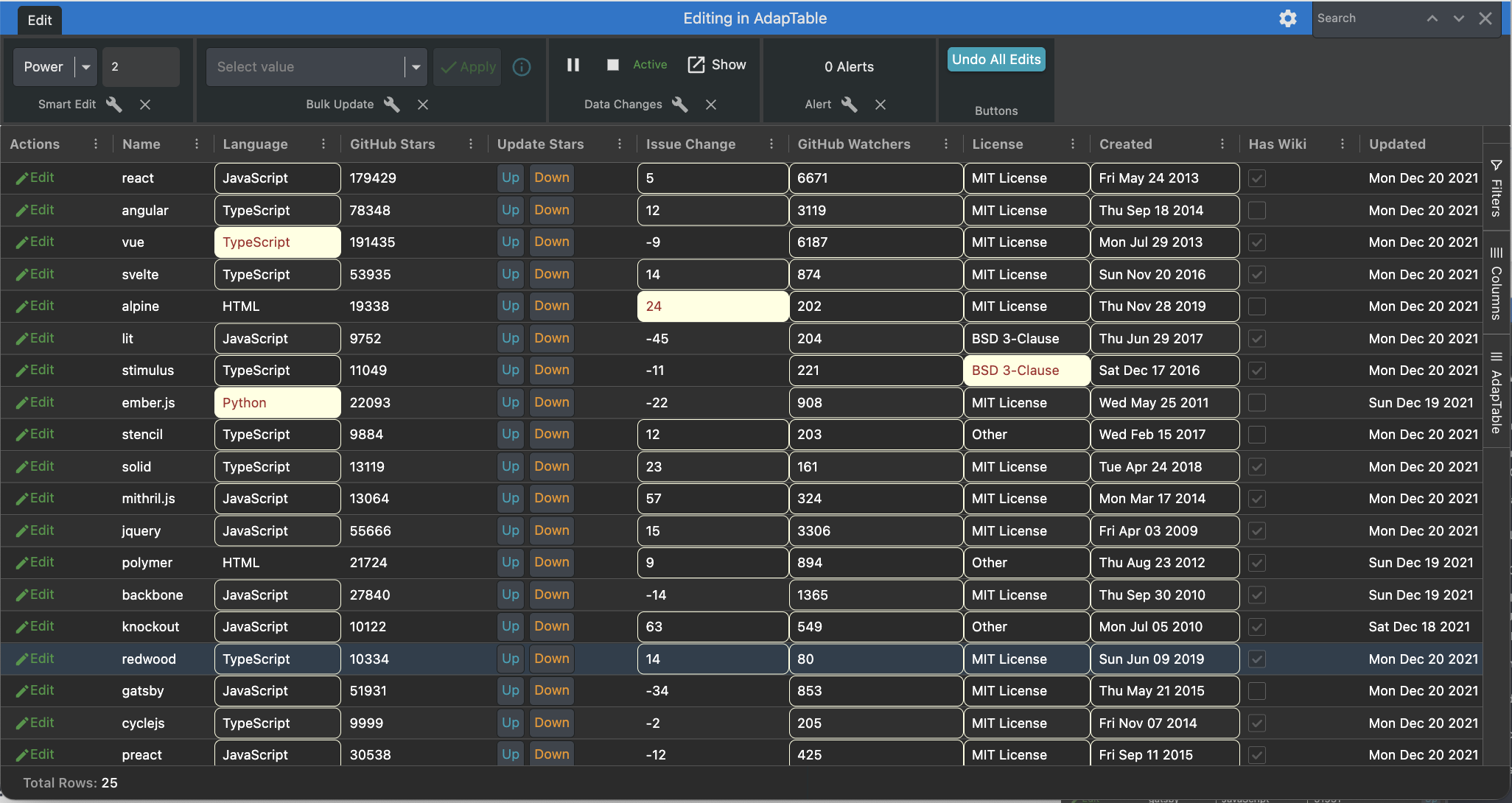
Validation
AdapTable providdes 2 main types of Data Validation:
- Client Validation - Undoes an Edit that breaks a Rule (leveraging a Validation Alert)
- Server Validation - Checks Validation on the Server and returns a result
In our demo we provide one example of each Validation, using the Issue Change Column:
- Client Side Validation - value cannot be negative (if so, a warning appears)
Alert: {
  AlertDefinitions: [{
      Name: 'alert-week_issue_change_negative',
      Scope: { ColumnIds: ['week_issue_change'] },
      Rule: { Predicates: [{ PredicateId: 'Negative' }]},
      AlertProperties: {
        PreventEdit: true,
        DisplayNotification: true,
      },
      MessageType: 'Error',
      MessageText: 'Week Issue Change cannot be negative!',
    }],
},- Server Side Validation - value cannot be greater than 60 (if so, we set edited value to 60)
editOptions: { // would typically happen on the server, rather than client...
  validateOnServer: (serverValidationContext: ServerValidationContext) => {
    return new Promise((resolve, reject) => {
      const cellDataChangedInfo = serverValidationContext.cellDataChangedInfo;
      if (cellDataChangedInfo.column.columnId == 'week_issue_change') {
        if (cellDataChangedInfo.newValue > 60) {
          resolve({
            newCellValue: 60,
            validationMessage: 'Week Issue Change cannot be greater than 60',
            validationHeader: 'Too High',
            messageType: 'Error',
          });
          return;
        }
      }
      resolve({});
    });
  },
},
Data Change History
AdapTable can display a list of all data changes that have happened in the current session.
In our demo we have set the (very configurable) Data Change History Monitor to:
- be turned on by default (so all data changes are automatically tracked)
- provided with an "undo" button which, when clicked, will undo the change
dataChangeHistoryOptions: {
  activeByDefault: true,
  changeHistoryButton: [{
      action: 'undo',
      label: (button, context) => { return context.isGroupNode ? 'Undo Group' : 'Undo';  },
      buttonStyle: { variant: 'raised', tone: 'accent' },
    }],
},
Undoing Data Changes
It's also possible for run-time users to undo edits directly in the Grid, without needing to open the Data Change History Monitor.
Find Out More
See the Undoing Data Edits Blog Post for more details on how to achieve this
In our demo we add a Custom Context Menu Item which appears only in cells which have been edited, and allows the run-time user to undo the edit directly.
contextMenuOptions: {
  customContextMenu: (context: CustomContextMenuContext) => {
    const { defaultAgGridMenuStructure, defaultAdaptableMenuStructure, gridCell, adaptableApi } = context;
    const undoEditMenuItem: UserContextMenuItem = {
      menuType: 'User',
      label: 'Undo Edit',
      icon: { name: 'undo' },
      hidden: !adaptableApi.gridApi.isCellEdited(gridCell),
      onClick: () => {
        const dataChange = adaptableApi.dataChangeHistoryApi.getDataChangeForGridCell(gridCell);
        adaptableApi.dataChangeHistoryApi.undoDataChangeHistoryEntry(dataChange);
        adaptableApi.gridApi.refreshGridCell(gridCell);
      },
    };
    return [ undoEditMenuItem, ...defaultAgGridMenuStructure, '-', ...defaultAdaptableMenuStructure ];
}},
Additionally we provide a Custom Toolbar which contains an Adaptable Button that clears all Edits that have been made:
dashboardOptions: {
  customToolbars: [
    {
      name: 'ButtonToolbar',
      title: 'Buttons',
      toolbarButtons: [
        {
          label: 'Undo All Edits',
          onClick: (btn: AdaptableButton<CustomToolbarButtonContext>, context: CustomToolbarButtonContext) => {
            const { adaptableApi } = context;
            const gridCells = adaptableApi.dataChangeHistoryApi.undoAllDataChangeHistoryEntries();
            adaptableApi.gridApi.refreshGridCells(gridCells);
          },
          buttonStyle: { tone: 'info', variant: 'raised' },
        },
      ],
    },
]},