AdapTable for AG Grid 23.0 Released
A new improved UI, 4 Styled Columns, Improvements to Calculated Columns, Format Column Numeric Presets and Scheduled Alerts
AdapTable 23.0 is the latest version of our market-leading AG Grid extension.
Important
AdapTable 23.0 is a major release and supports AG Grid v.35.3
AdapTable 23 leverages the best in class UI tools (Tailwind, shadcn, Base UI) to provide a clean, modern and flexible UI - which now comes with full Aria support.
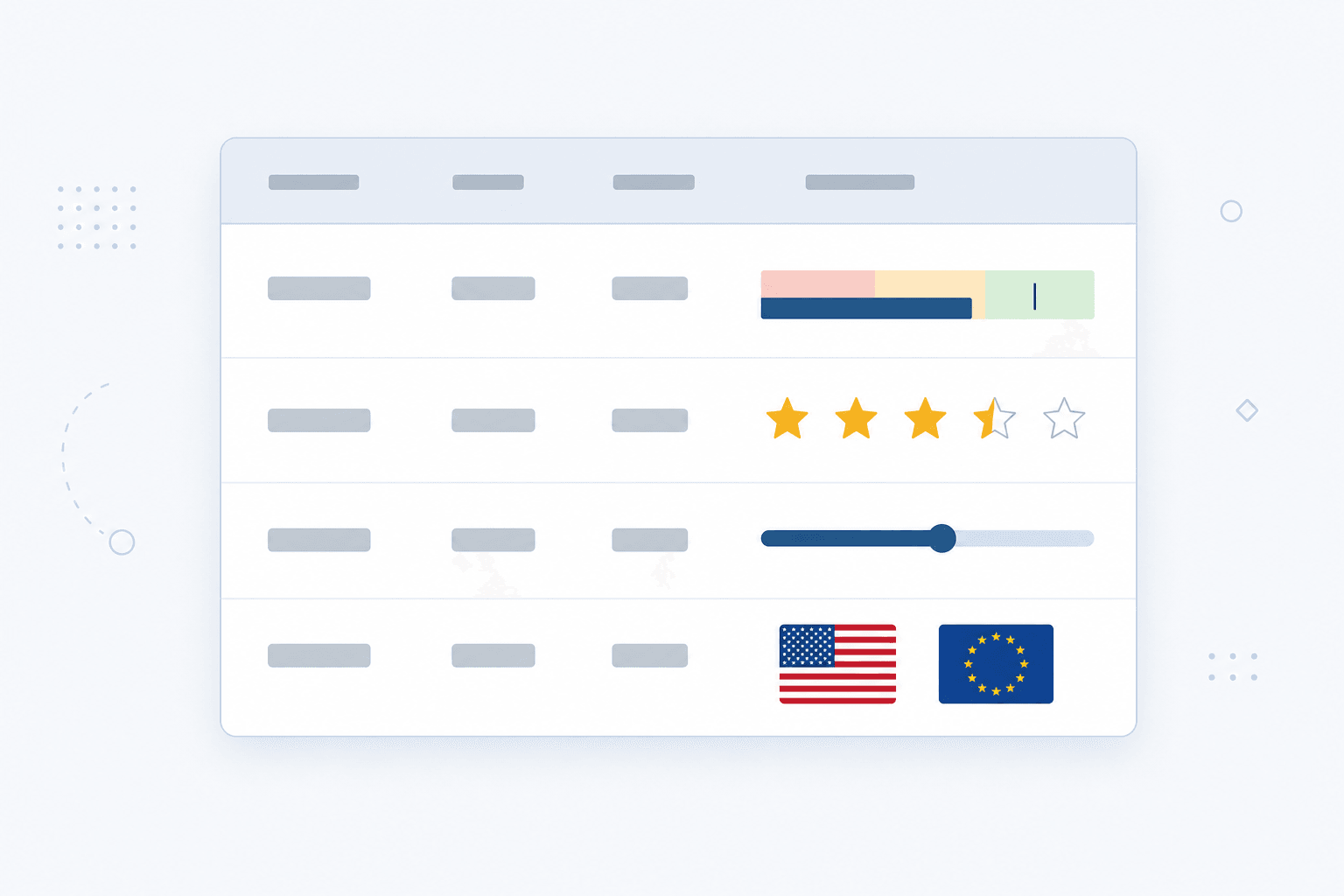
We have also provided 4 new Styled Columns - Bullet Chart, Rating, Icon and Range Bar - to allow our users to see their data in ever more powerful and intuitive ways.
Another great new addition is Scheduled Alerts which, together with the existing Scheduled Reports, leverage Cron expressions to allow users to schedule key grid activities.
Styled Columns
AdapTable 23 provides 4 new Styled Columns:
| Styled Column | Description |
|---|---|
| Bullet Chart | Renders a bullet graph inside a cell |
| Rating | Renders a row of icons (e.g. stars) scaled to the cell value |
| Range Bar | Shows value and optional reference on track between min & max |
| Icon | Maps cell values to icons with presets and optional cell text |
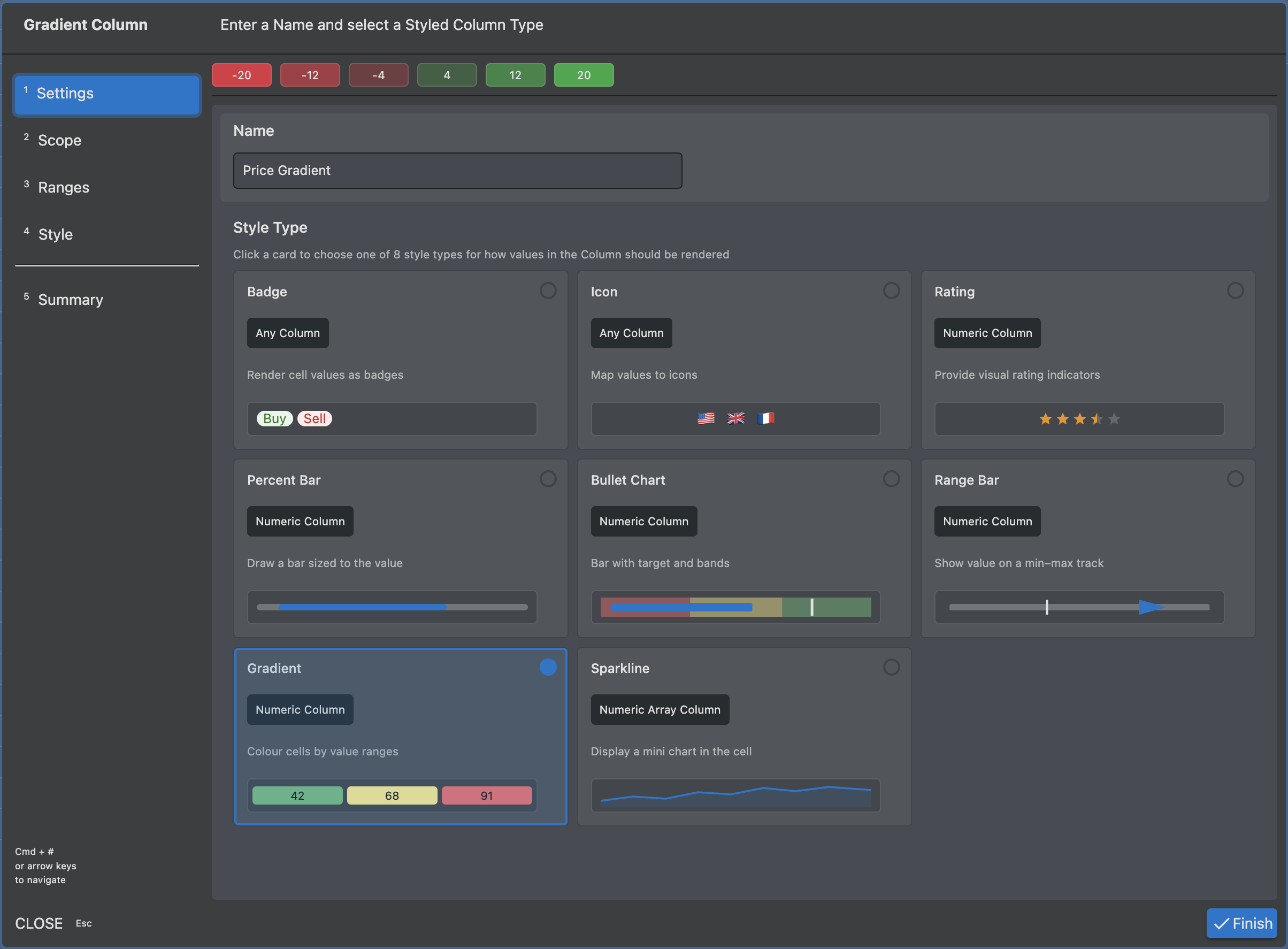
Each Style is available at runtime via the Styled Column Wizard.
This includes a live preview as you configure each step.
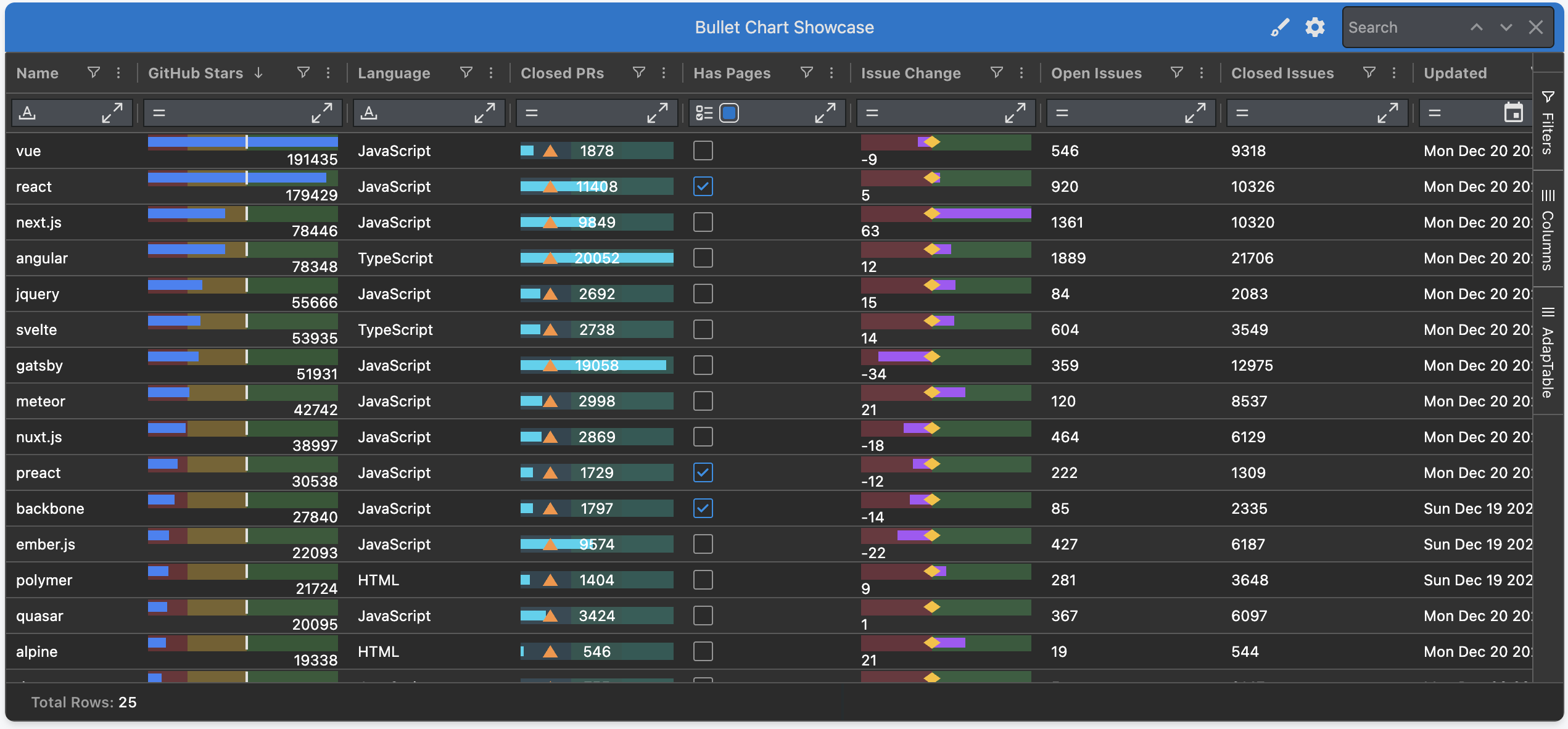
Bullet Chart Style
The Bullet Chart Style turns any numeric column into a compact, in-cell bullet graph.
It shows a single row of pixels that answers the two questions every KPI grid hides:
- "how is this row doing against its target?"
- "which qualitative band does it sit in?"
Each cell renders the value as a bar, drawn on top of one or more coloured bands (e.g. poor / ok / good), with an optional target marker sitting on the bar.
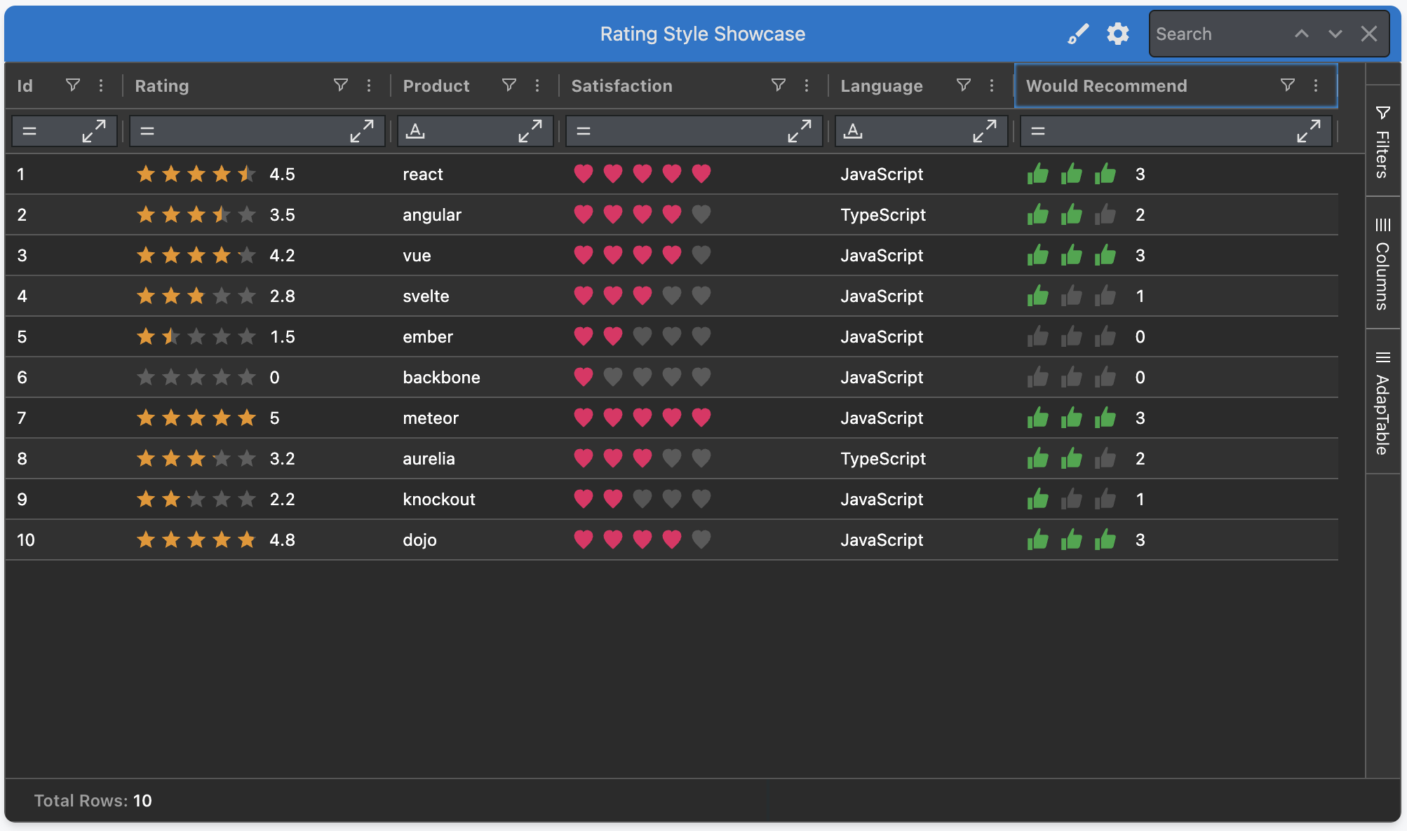
Rating Style
The Rating Style turns a numeric column into a familiar "score out of N" visual — instantly legible for review scores, satisfaction levels, risk bands and any small ordinal scale.
Each cell renders the value as a row of icons. You can:
- Choose from
Star,Heart,CircleorThumb - Set the scale via
Max(e.g.5for stars-out-of-5,10for stars-out-of-10) - Enable half fills so a
4.5draws four-and-a-half icons - Optionally show the numeric value alongside the icons
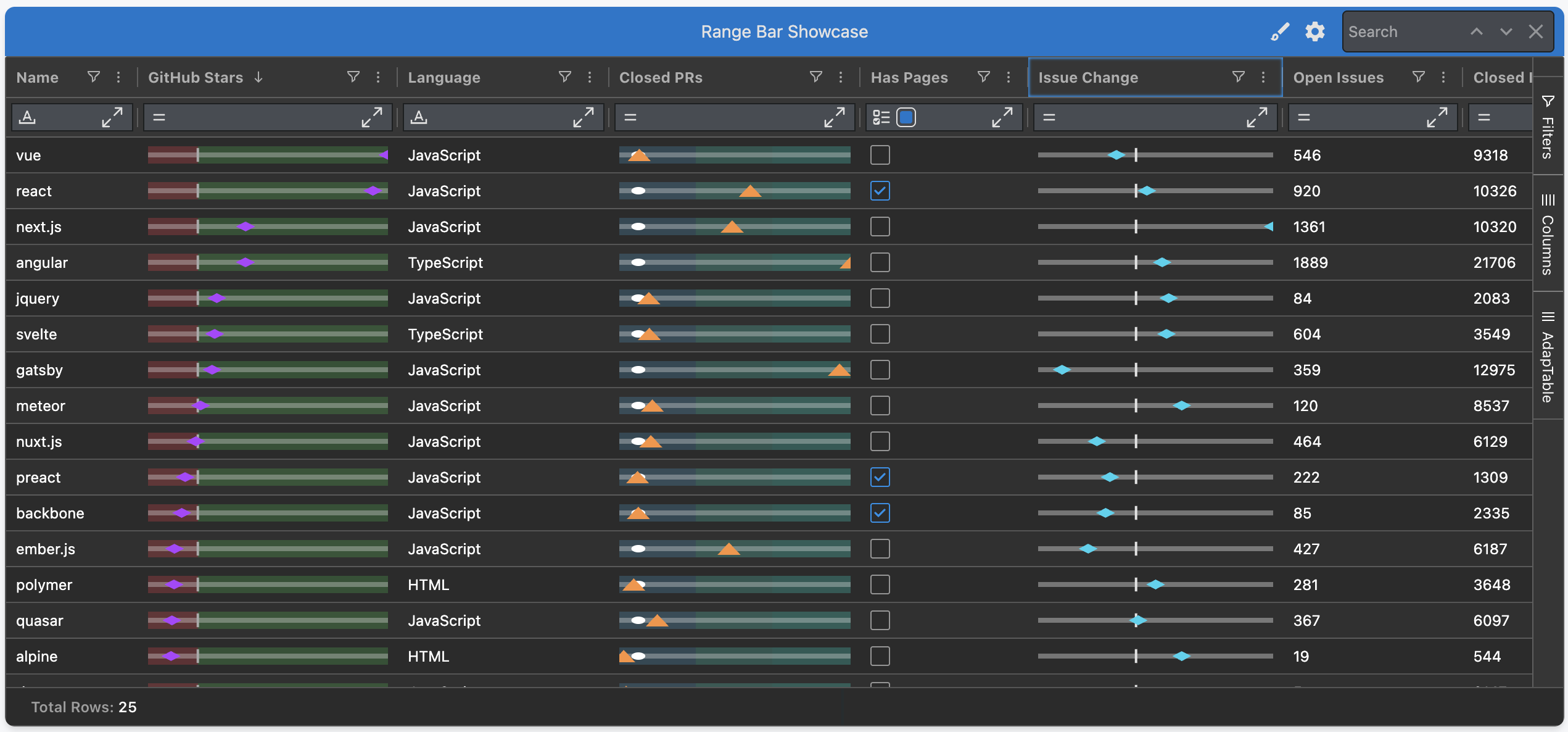
Range Bar Style
The Range Bar Style renders a thin horizontal track between a Min and a Max in each cell, with a marker at the cell value's position along the track.
It answers two questions at once:
- "where between Min and Max does this value sit?"
- "how does it compare to a reference?"
Hint
Min,Max&Referencecan be hard-coded numbers, another column's id, or column aggregates- This is perfect for things like price vs 52-week range, bid / ask spread or value within an SLA
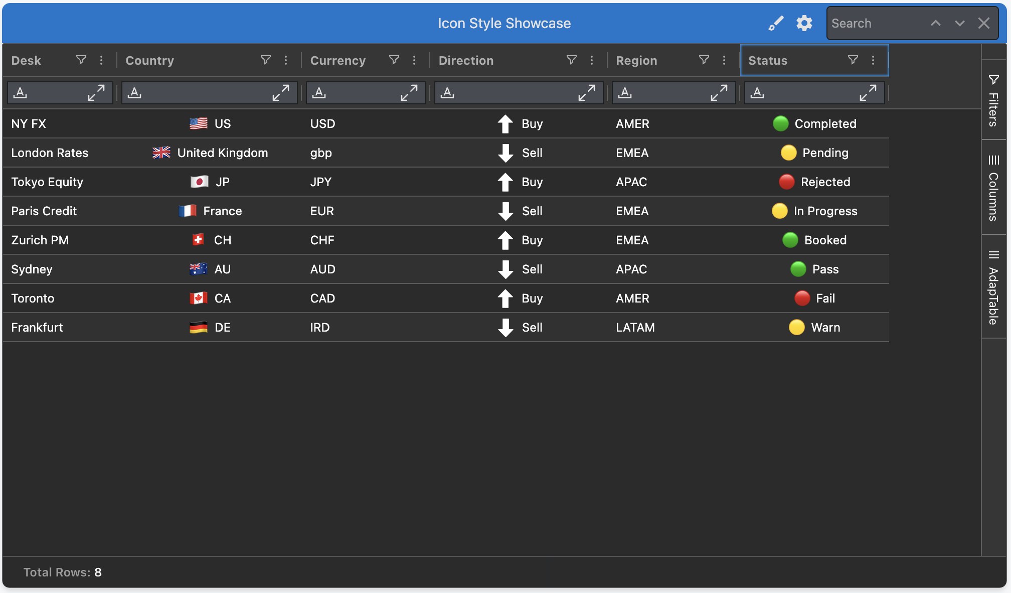
Icon Style
The Icon Style maps each cell value to a single visual — a flag, a glyph, an emoji or a custom image — via simple key → icon mappings.
It's purpose-built for one-glyph-per-cell visual recognition:
- Built-in presets ship for
Flags,Currencies,TrendandStatus - Mix presets with your own mappings, or supply your own SVGs / image URLs
- Optionally pair the icon with companion text (cell value or mapping description)
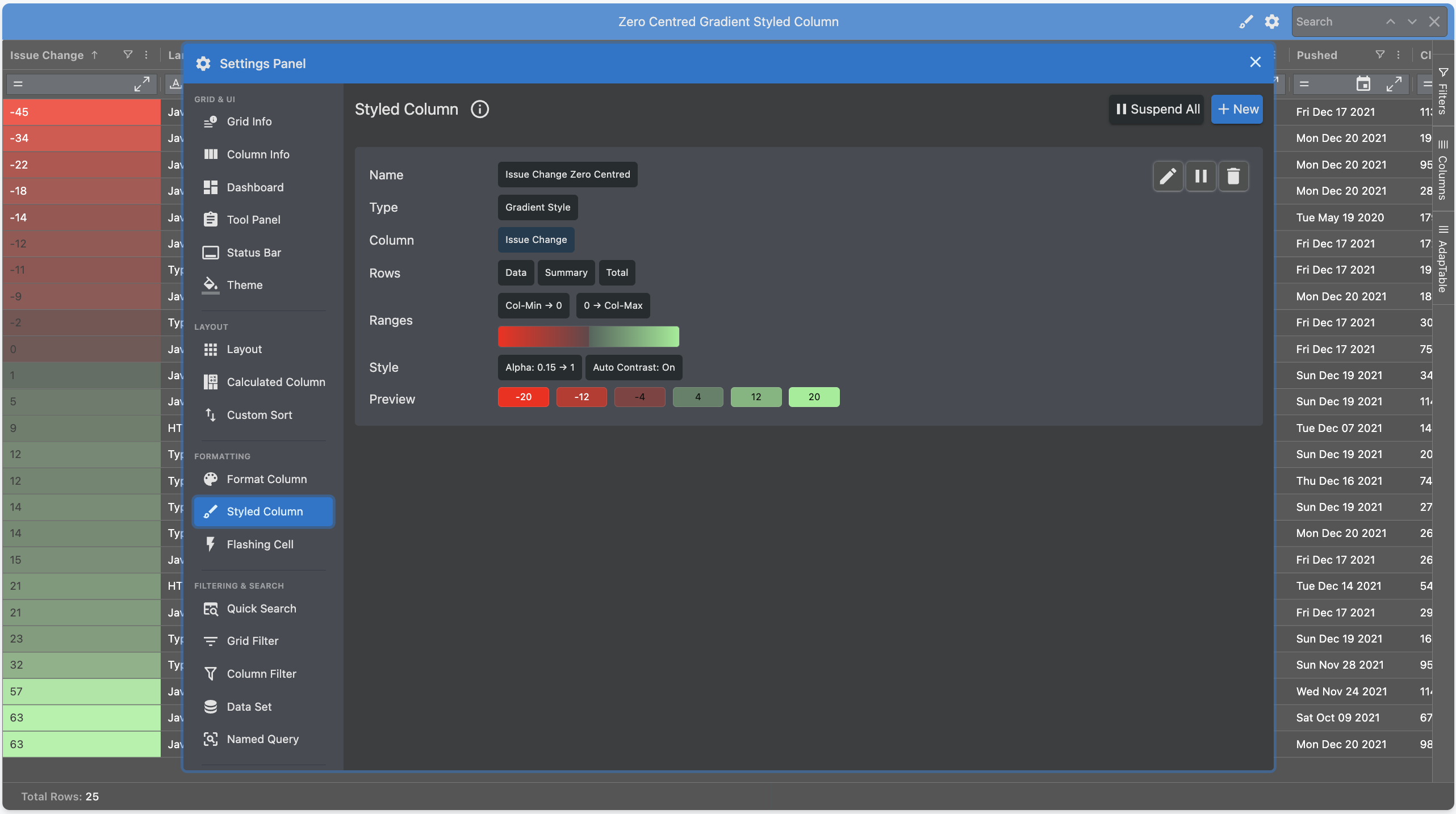
Enhancements to Existing Styled Columns
The 4 existing Styled Columns have all also been substantially improved in v.23:
- Gradient — a new zero-centred range for columns with negative numbers
- Percent Bar — better support for negative ranges
- Badge — many new styling and formatting options
- Sparkline — an improved UI makes it easier to create sparklines at runtime
New and Enhanced AdapTable Features
AdapTable 23 provides a huge number of new features and enhancements.
Note
These were overwhelmingly driven by your suggestions and requests, so keep them coming...
New Scheduled Alerts
Scheduled Alerts fire on a clock rather than responding to data changes or given rules.
Breaking Change
Scheduled Alerts replace the previous Reminders module with a richer, fully cron-aware timing model
The Schedule can be either:
- one-off - at a specified ISO datetime
- recurring - driven by a 5-field Cron expression (e.g.
30 17 * * 1-5for 17:30 on weekdays)
Hint
- Scheduled Alerts are ideal for operational prompts that previously had to live outside AdapTable
- e.g. "run end-of-day report at 17:30 weekdays" or "review risk dashboard at 9am every morning"
Flashing Calculated Columns
Calculated Columns have been extended to react to 2 existing AdapTable features.
When a referenced column ticks, the Calculated Column's value is recomputed and can:
- Flash the changed cell (up / down / any change), just like a native ticking column
- Trigger Data Change Alerts when the new value matches an Expression (e.g.
[price] > 50)
Note
- AdapTable provides full chaining (i.e. one Calculated Column references another)
- The referenced Calculated Column flashes and fires alerts when the upstream value changes
Weighted Average in Column Menu
AdapTable has long had first-rate support for Weighted Averages.
In version 23 we take this a stage further by allowing run-time users to create weighted averages via the AG Grid column menu.
Note
You first select the column you want to aggregate, and then the column to weigh via a sub menu
Format Column Presets
We have significantly expanded the range of Format Column Numeric Presets:
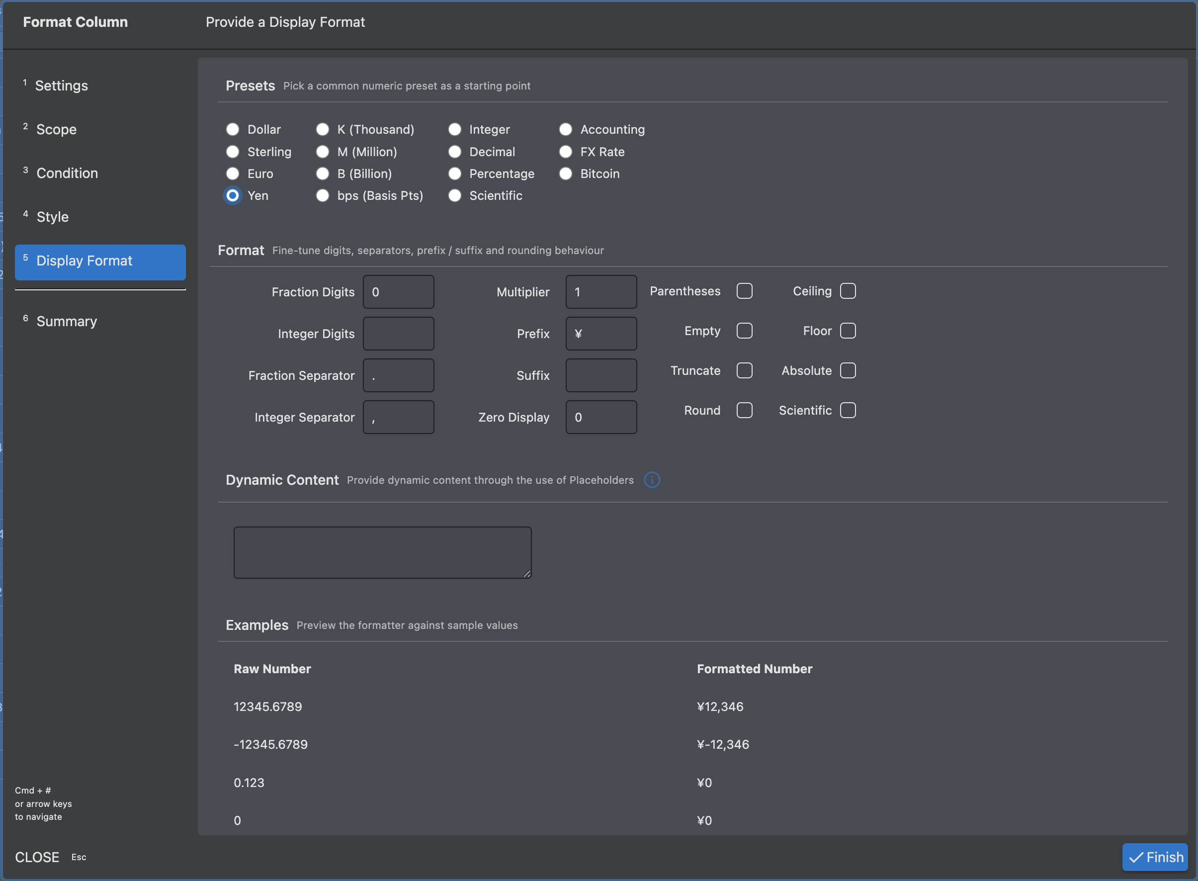
In addition, it's now possible to provide the preset directly in Format Column Initial State:
FormatColumn: {
    FormatColumns: [
      {
        Name: 'formatColumn-open-total-issue-ratio',
        Scope: { ColumnIds: ['open-total-issue-ratio'] },
        DisplayFormat: 'Percentage',
      },
      {
        Name: 'formatColumn-week_issue_change',
        Scope: { ColumnIds: ['week_issue_change'] },
        DisplayFormat: 'Accounting',
      },
    ],
  },
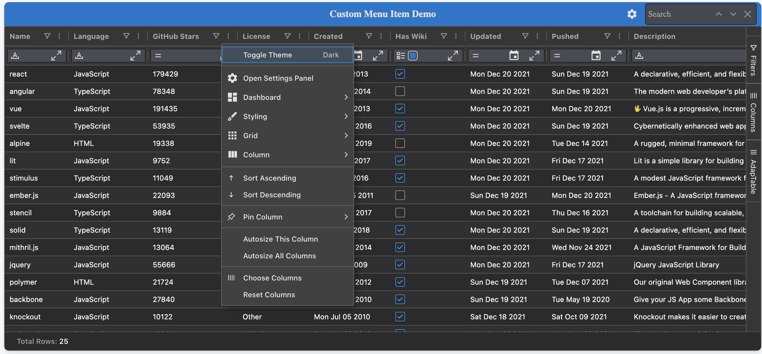
Framework Components in Menus
The Column Menu and Context Menu now both accept framework components.
This means that you can render React, Angular or Vue components directly inside a menu item.
Hint
This unlocks rich, interactive content — e.g. sliders, buttons, colour pickers - in your chosen framework
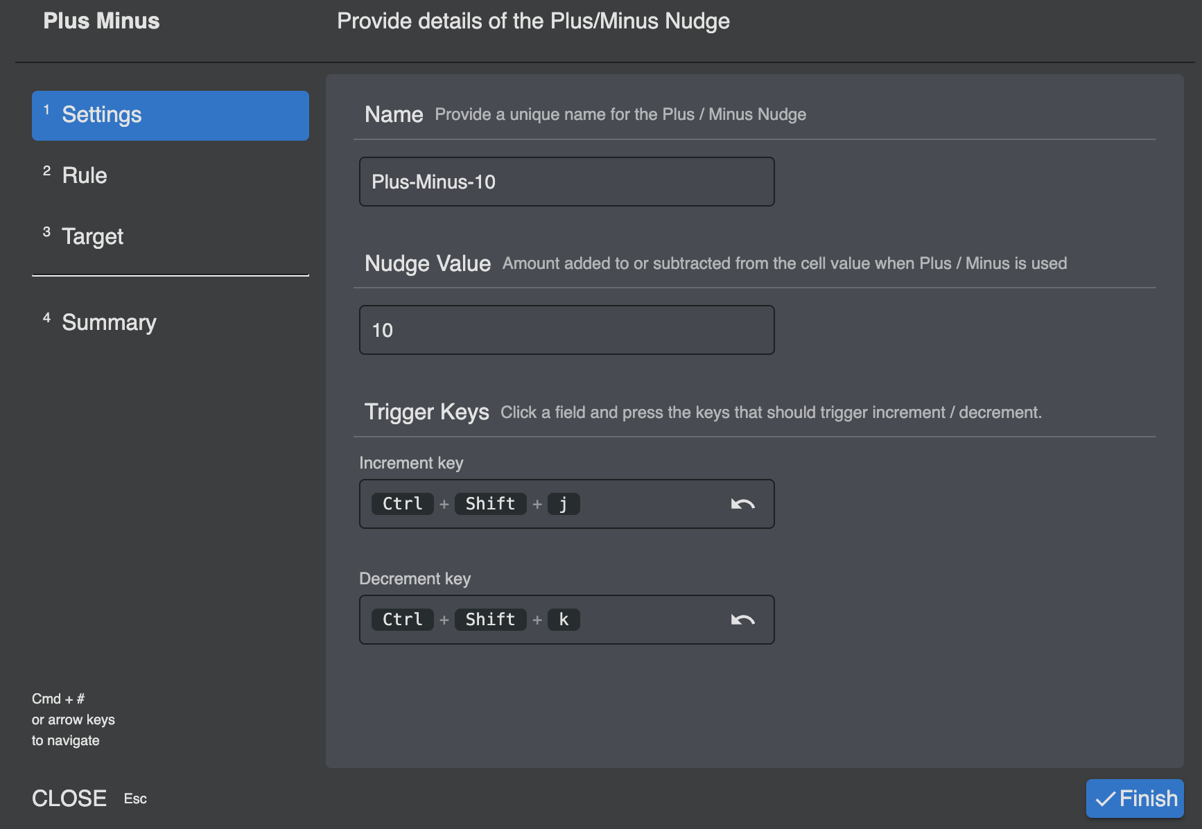
Customisable Plus Minus Keys
Plus Minus nudges now support custom increment / decrement keys.
This allows developers (and end users) to wire in their own keyboard shortcuts if required.
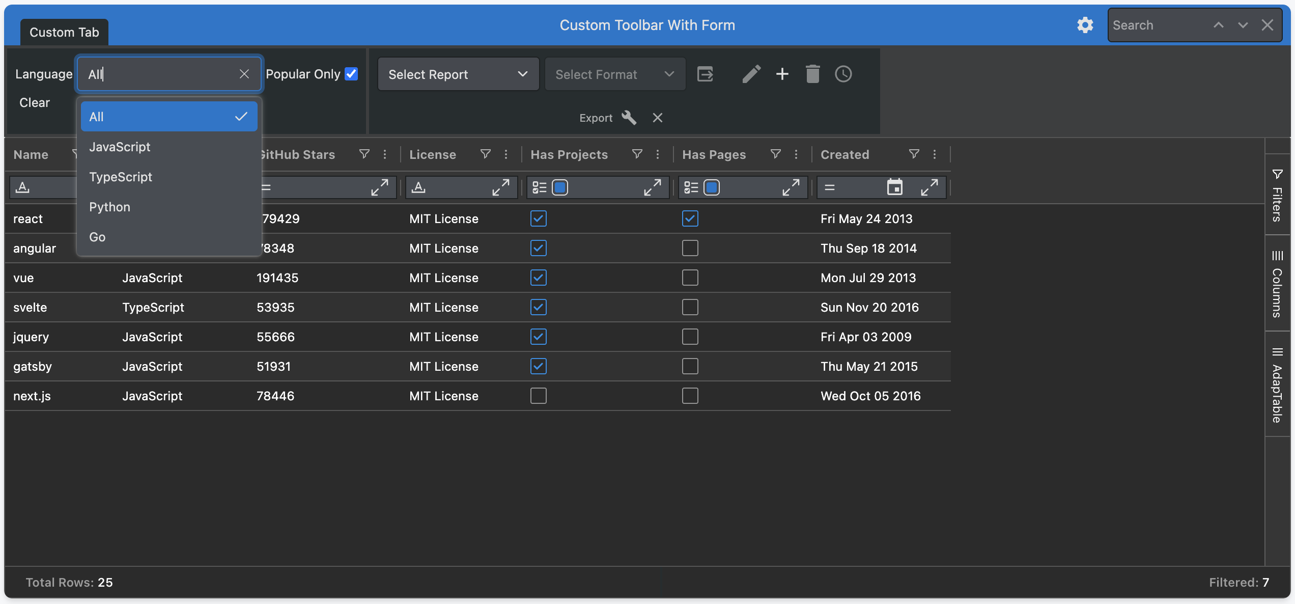
Forms in Custom Toolbars
Custom Toolbars can now include a fully powered Adaptable Form.
This allows you to insert a mini data-entry panel directly in the Dashboard with just a few clicks.
UI Improvements and ARIA Support
Version 23 includes further changes and improvements to the AdapTable UI including:
- improvements to usability and flexibility of the UI Wizards
- new Select and Dropdown components
- further integration with Tailwind
- extensions to the Colour Palette which has been made more customisable
In addition, the AdapTable UI now provides comprehensive accessibility (ARIA) and keyboard support — menus, dialogs, dropdowns and wizards follow WAI-ARIA Authoring Practices by default.
Find Out More
- See Accessibility & Keyboard Support for further details about the changes made
- For background on the UI refresh, see the blog post on Tailwind, shadcn and Base UI in AdapTable
Documentation
The AdapTable documentation contains several improvements aimed at helping you find what you need faster, and learn more about what AdapTable offers:
- Framework-focussed — pick a framework and only see the docs and demos relevant to it
- Showcase Demos — 8 fully working examples of AdapTable tackling real-world use cases
- Feature List — every AdapTable feature indexed with dev properties and UI components
- What's New — a single place to browse new releases, features and blog posts
Get Started
If you are an existing AdapTable user, simply download the latest version from npm.
Like all AdapTable releases, v.23 is available in 4 framework flavours:
- TypeScript (the default)
- AdapTable React
- AdapTable Angular
- AdapTable Vue
If you’re not yet using AdapTable, please get in touch to learn how AdapTable extends AG Grid to help you access, manage, edit and visualise your data in ways no other DataGrid solution allows.
You can also download a free no-obligation trial licence so you can try out AdapTable for yourself.