Moving to Tailwind, Shadcn & Base UI
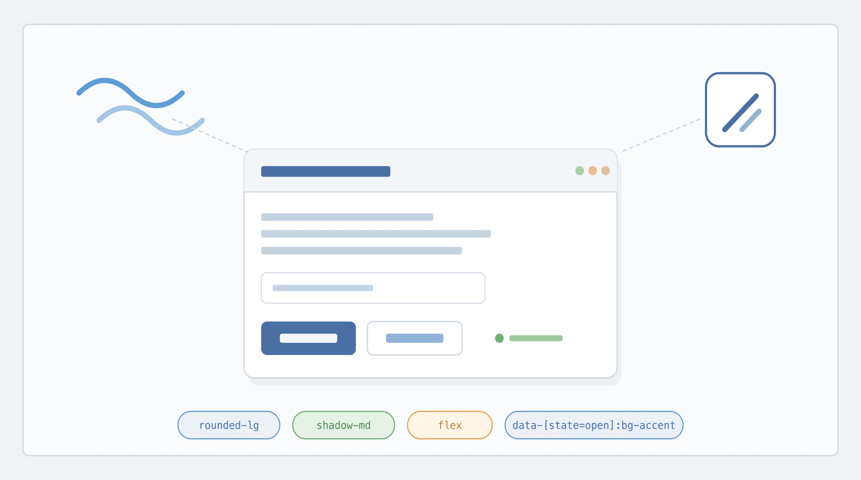
We rebuilt AdapTable's UI primitives on top of TailwindCSS + shadcn/ui and Base UI, giving our users a faster, more accessible and more easily themeable experience across AdapTable
Important
- AdapTable's component library has moved to TailwindCSS & shadcn/ui, layered on top of Base UI
- This gives AdapTable a modern, accessible, themeable, Tailwind-driven UI foundation
AdapTable has always shipped a rich, opinionated UI out of the box.
This includes wizards, dashboard toolbars, tool panels, cell editors, pickers, dialogs, column and context menus, and an impressive range of bespoke controls.
As our UI surface has grown, we decided it was time to invest in the foundation that all of these components sit on.
This is what we have done in our recently released AdapTable Version 23.
This post has 2 purposes in mind:
- to explain to our developer community what has changed in the AdapTable UI
- perhaps more importantly to outline what this means for the run-time users who rely on AdapTable every day to run business-critical applications
What Changed
Previously, AdapTable shipped with a hand-rolled component set built up over many years.
It worked well, but maintaining dropdowns, popovers, comboboxes, tooltips, selects and menus from scratch - with full accessibility - is a significant undertaking.
More importantly, it was not core to what AdapTable does - which is extending AG Grid so you can visualise, manage, edit, understand and leverage your data in ever more powerful ways.
So we've adopted the combination that is fast becoming the default stack for serious React applications (AdapTable uses React internally):
| Layer | Library | Role |
|---|---|---|
| Primitives | Base UI (@base-ui/react) | Unstyled, accessible, composable components |
| Patterns | shadcn/ui | Conventions for assembling and styling primitives |
| Styling | Tailwind + CSS variables | Utility-first styling and token-driven theming |
| Icons | Lucide | Consistent, tree-shakeable icon set |
Note
- Base UI is the headless component library from the team behind Radix UI and MUI - it provides the behaviour, accessibility and state management
- shadcn/ui is not a traditional npm package but a set of conventions and recipes for building your own component library on top of headless primitives
This means every dropdown, popover, combobox, tooltip, menu and dialog in AdapTable is now built on the same small, well-tested set of primitives.
Hint
This gives us the flexibility of owning our components, without the complexity of owning accessibility
Deep Dive
CSS Variable Renames
Better Accessibility (ARIA) Out of the Box
The biggest single win from this migration is accessibility.
Note
- Base UI implements the WAI-ARIA Authoring Practices for every primitive it ships
- Roles, states, relationships and focus management are all handled correctly by default
In practical terms, this means AdapTable UI now:
- announces menus, listboxes, comboboxes, dialogs and popovers correctly to screen readers
- exposes correct
aria-attributes:label,expanded,selected,controlsandactivedescendant - manages focus traps in modals and popovers, and restores focus when they close
- keeps
aria-labelledby/aria-describedbyrelationships consistent across our components
For users working in regulated environments - or simply users who rely on assistive technology - this is a material improvement on what we had before.
First-Class Keyboard Navigation
Hand-in-hand with ARIA comes first-class keyboard support.
Every interactive component in AdapTable - menus, comboboxes, selects, tabs, dialogs, tooltips - now follows the keyboard interaction patterns that advanced users expect:
| Keystroke | Behaviour |
|---|---|
| Arrow keys | navigate options in menus, selects and comboboxes |
| Home / End | jump to the first or last item |
| Type-ahead | jump to matching items in menus and listboxes |
| Escape | close popovers, dialogs and menus and return focus to the trigger |
| Tab / Shift+Tab | follow a predictable focus order, including inside modal dialogs |
| Enter / Space | activate the currently focused item |
This is particularly valuable for AdapTable's power users on trading floors and operations desks, who rely on keyboard-driven workflows and rarely reach for the mouse.
Cleaner, More Flexible Styling
Under the new system, every component is styled with Tailwind utility classes, driven by a small set of CSS variables (design tokens).
This provides multiple benefits in a single step:
| Benefit | How it works |
|---|---|
| Consistent theming | colours, spacing, radii and typography are derived from one set of tokens |
| Built-in dark mode | light and dark themes are just two sets of CSS variable values |
| Easier white-labelling | customers who need to match a corporate palette can do so by overriding a handful of CSS variables, rather than fighting with deeply nested selectors |
| Fewer regressions | fewer bespoke stylesheets mean fewer places for visual bugs to hide |
No Clashes With Your Own Tailwind
A common (and entirely reasonable) concern when a library adopts Tailwind is: "what happens if my app is already using Tailwind, possibly at a different version, with my own utility classes?"
Important
AdapTable's Tailwind setup is fully scoped under a twa: prefix - so every utility class AdapTable emits looks like twa:bg-color-accent, twa:flex, twa:p-2, rather than the bare bg-color-accent, flex, p-2.
In practice, this means:
- No class-name collisions - AdapTable's
twa:flexand your app'sflexare two completely separate utilities, and can't overwrite each other - No version coupling - your app can stay on its current Tailwind version (v3, v4, or no Tailwind at all); AdapTable ships its own self-contained Tailwind build
- No configuration required - you don't need to extend your
tailwind.configor add AdapTable to yourcontent/@sourcepaths for anything to work - Safe to drop into any app - whether your host app uses Tailwind, styled-components, CSS modules, vanilla CSS, or a mix, AdapTable's styles stay inside their own namespace
Hint
- AdapTable fits right into applications already using Tailwind far more naturally than before
- Thanks to the
twa:prefix it does so without asking you to change your existing styling setup
Deep Dive
Troubleshooting: cascade layer order
Performance and Bundle Improvements
Rebuilding on top of Base UI and Tailwind also gave us an opportunity to clean up the bundle.
Note
- Headless primitives are lighter than their styled equivalents - there is no CSS-in-JS runtime involved
- Tailwind's utility classes compress extremely well, and produce a small, shared stylesheet rather than per-component style blocks
- Tree-shaking is more effective: we only ship the primitives we actually use
For end users this manifests itself in 2 noticeable ways:
- a much faster initial render
- smoother subsequent UI interactions
This is particularly noticeable on large, data-dense screens (where AdapTable is often used).
What Stays the Same
Important
This is an internal UI refresh - not a breaking change for consumers of AdapTable
- All existing AdapTable modules, APIs and config options continue to work exactly as before
- Existing styling and theming APIs are preserved
- Your existing custom toolbars, custom cell renderers, custom context menus and Adaptable Buttons all continue to work unchanged
If you upgrade and do nothing else, the main thing you will notice is that the UI feels snappier, cleaner, and more consistent.