Gradient Column Style
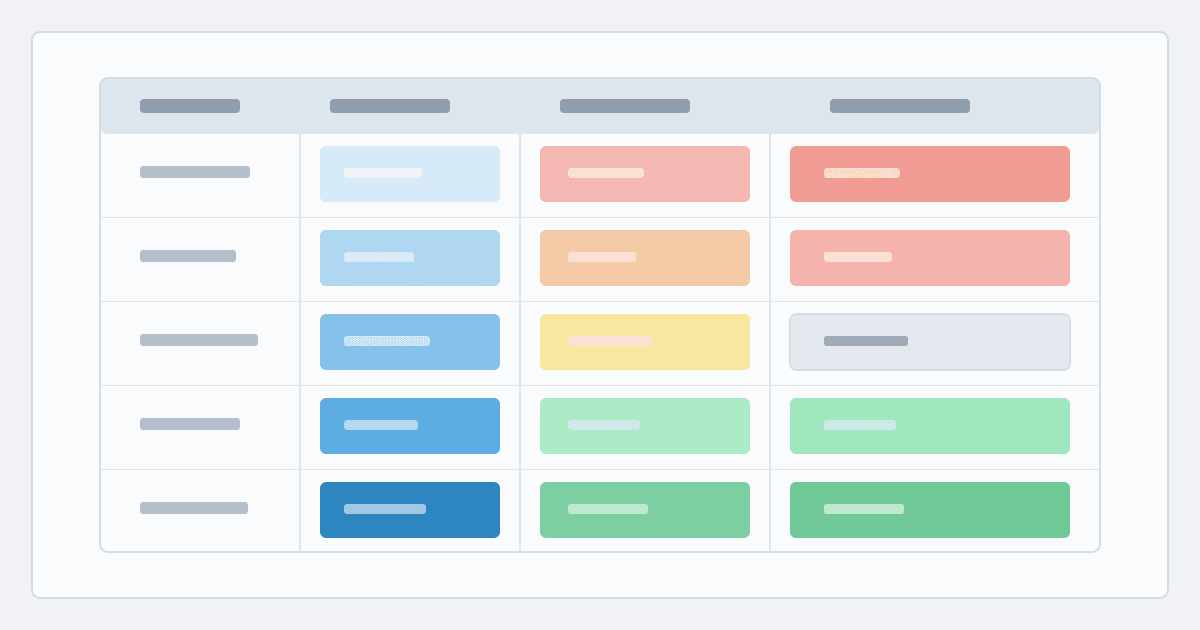
The Gradient Style contains many powerful features, including traffic-light bands, single-colour ramps, zero-centred deltas, column comparisons and a huge range of styling options
AdapTable's core mission is simple: to help developers and end users design complex, powerful, often cutting-edge, AG Grid functionality with a minimum of effort.
A great example is Styled Columns: intuitive, flexible styles creatable with just a few clicks.
This post looks at the Gradient Column Style which turns a numeric column into a live heat map.
Important
- AdapTable provides 8 Styled Columns in total to match every possible use case
- The others are: Percent Bar, Badge, Sparkline, Bullet Chart, Rating, Range Bar and Icon
Each cell in a Gradient Style Column is tinted from its value’s position on a [Min, Max] scale.
This allows run-time users to easily gauge a cell's value against other cells in the Column.
In the Demo
- To illustrate Gradient Styles, we created an accompanying demo, containing 4 Gradient Columns:
GitHub Stars— a single colour range (blue) ramped fromCol-MintoCol-MaxClosed Issues— a three-band traffic light numeric range (red / orange / green)Open Issues— a purple Column Comparison againstClosed Issueson the same rowWeekly Issue Change— a zero-centred range with gradient of red below0and green above
- We added Column Formatting to 2 columns:
Closed Issues(italic right-aligned formatting)GitHub Stars(Kdisplay format, centred, bold/brown - conditional when over 100K)
Ranges
Every Gradient Column contains a Range which includes the two things required to style every cell:
- The
[Min, Max]window the cell value sits inside - The base
Colorto interpolate the alpha ramp over that window
Hint
- AdapTable linearly interpolates the window's alpha: lighter at minimum, more opaque at maximum
- This ensures that cells naturally darken as their value moves up
AdapTable provides four mutually-exclusive Range flavours:
| Range Type | Description |
|---|---|
| Number | Contiguous bands with literal or column-aggregate boundaries |
| Percentage | Bands expressed as 0–100 along the column’s overall span |
| Zero Centred | A diverging two-band gradient that splits at 0 — for signed values |
| Column Comparison | Colours each cell relative to another column on the same row |
Number Range
A Number Range is a chain of contiguous bands; each band has its own Min, Max and Color.
Hint
This allows you to create traffic-light banding and other effects
Key behaviours:
- Bands stay stitched together — change one band’s
Maxand the next band’sMinfollows - A single band is fine (one colour across the whole column); add more bands for thresholds
- Hard-coded numbers can be provided, for when you know the thresholds (e.g.
1000,5000) - Outer endpoints can also be dynamic —
Col-Min/Col-Maxusing column’s visible extremesNote
Col-MinandCol-Maxare computed across visible rows and re-evaluate as filters change
In the Demo
- GitHub Stars has a number Range: one blue band from
Col-MintoCol-Max
GradientStyle: {
  RangeValueType: 'Number',
  CellRanges: [
    {Min: 'Col-Min', Max: 'Col-Max', Color: 'DodgerBlue'},
  ],
},- Closed Issues has 3 number ranges: red/orange/green with mixed hard-coded &
Col-*endpoints
GradientStyle: {
  RangeValueType: 'Number',
  CellRanges: [
    {Min: 'Col-Min', Max: 1000, Color: 'Red'},
    {Min: 1000, Max: 5000, Color: 'Orange'},
    {Min: 5000, Max: 'Col-Max', Color: 'Green'},
  ],
},
Percentage Range
Same band shape as Number Range, but boundaries are percentages between 0 and 100.
Hint
- Use this when you want to configure things like “bottom 20%” or “top 10%”
- You can do this without knowing absolute min/max ahead of time
The first band’s Min locks to 0 and the last band’s Max locks to 100.
AdapTable maps each cell onto that axis relative to Col-Min / Col-Max.
Zero Centred Range
Zero Centred Ranges are used for columns with both negative and positive values.
AdapTable automatically creates two bands that meet at 0:
- one between
Col-Minand0 - another between
0andCol-Max
The negative band is automatically reverse-shaded, so values get darker the further they are from zero in either direction — ideal for issue change, P&L or price deltas.
In the Demo
- Weekly Issue Change uses Zero Centred with red negatives and green positives
- It also uses
AutoContrastTextso labels stay readable on darker fills
GradientStyle: {
  ZeroCentred: {
    NegativeColor: '#ff5555',
    PositiveColor: 'LightGreen',
  },
  AutoContrastText: true,
},
Column Comparison
Alternatively, AdapTable provides an option for you to colour each cell relative to another column on the same row — e.g. open vs closed issues, or filled vs target quantity.
Each cell is coloured as a share of the comparison column’s value on that row (from MinValue up to MaxValue).
Hint
This is useful when you want the Gradient to read as a % fill of another column’s value
In the Demo
- Open Issues uses a purple Column Comparison against Closed Issues
MinValueis0;MaxValueis theclosed_issues_countcolumn id
GradientStyle: {
  ColumnComparison: {
    MinValue: 0,
    MaxValue: 'closed_issues_count',
    Color: 'Purple',
  },
},
Styling
AdapTable also provides options for tuning how the ramp looks and can be formatted.
-
Reverse Gradient on a Number or Percentage band flips the default behaviour where higher values look darker, so that lower values draw more attention (fewer open PRs, lower risk scores)
-
Alpha Bounds keep lightest cells slightly tinted (
MinAlpha: 0.1) and cap how strong darkest cells become (MaxAlpha: 0.85) - by default the fill interpolates from transparent to opaque -
Auto Text Contrast picks a readable foreground from the computed background for each cell
In the Demo
- Auto Text Contrast is enabled on
Weekly Issue ChangeColumn - This is why the values -34 and -45 are white font (and all other cells in the Column are black)
-
Tooltips can show
CellValue(display value of the current cell) orPercentageValue(cell’s position along the active min–max scale) -
Formatting the Gradient Cell is also possible — AdapTable merges a Format Column with the Gradient by slice
Note
- Gradient owns the Cell's background; Format Column supplies display format, alignment and font
- See Formatting Gradient Styles for full details of how Formatting works with Gradient Styles
In the Demo
- GitHub Stars has two Format Columns merged with its Gradient:
Kdisplay format and centre alignment- Conditional bold brown font when the value is greater than
100000
{
  Scope: {ColumnIds: ['github_stars']},
  DisplayFormat: {
    Formatter: 'NumberFormatter',
    Options: {Multiplier: 0.001, Suffix: 'K'},
  },
  Style: {Alignment: 'Center'},
},
{
  Scope: {ColumnIds: ['github_stars']},
  Style: {FontWeight: 'Bold', ForeColor: 'Brown'},
  Rule: {BooleanExpression: '[github_stars] > 100000'},
}- Closed Issues is italic and right-aligned — the traffic-light Gradient still owns the cell background
{
  Scope: {ColumnIds: ['closed_issues_count']},
  Style: {Alignment: 'Right', FontStyle: 'Italic'},
},
Feedback
- The Gradient Column Style provides huge amounts of configurable functionality out of the box
- If you would like to learn about the many other similar features in AdapTable please get in touch