FDC3 Demo App
Summary
- This page describes a demo app that illustrates AdapTable's FDC3 capability
- The app leverages the first-rate Connectifi Sandbox which can be used for testing FDC3
FDC3 is all about interopability with external applications and widgets.
For this reason, its not possible to provide an isolated demo of FDC3 features in AdapTable, in the same way we can for all other AdapTable Modules.
Instead this page walks through an existing FDC3 Demo that illustrates some of AdapTable's FDC3 functionality.
Find Out More
Demo Introduction
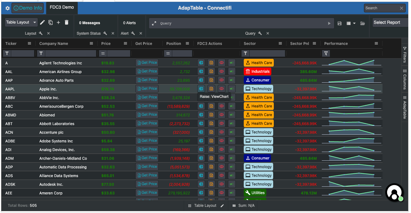
In the demo app we illustrate how AdapTable users are able to:
- Raise FDC3 Intents
- Listen for FDC3 Intents
- Broadcast FDC3 Context
- Listen for FDC3 Context
- Raise a Custom FDC3 Intent
- Define FDC3 Action Buttons, Action Columns and Context Menu Items
Hint
- The demo app primarily uses the FDC3 Instrument Context to manage Intents and Context
- But all FDC3 context types are available out of the box in AdapTable
The demo leverages the excellent - and free(!) - Connectifi Sandbox as the desktop agent
Caution
The data in the app is purely meaningless dummy data for illustration purposes; only the Tickers are real
Demo Step by Step
Here are the key steps performed by the demo to leverage AdapTable's FDC3 functionality:
Developer Guide
Creating the demo FDC3 app
fdc3Options: {
  gridDataContextMapping: {
    'fdc3.instrument': {
      name: '_colId.Name',
      id: { ticker: '_field.Symbol' },
    },
  },
}Create FDC3 Data Mapping - to FDC3 Instrument Context:
- Use
Namecolumn (defined by '_colId') as the Instrument Nam3 - Use
Symbolfield (defined by '_field') to map to Ticker (inidprop)
Note
- Mappings provide the “glue” to map AG Grid’s data and columns to required FDC3 behaviour
- AdapTable looks at the mappings to work out which columns to use when creating Intents and Contexts
- This app has just one mapping but there is no limit to how many can be provided
raises: {
   ViewChart: [
    {
      contextType: 'fdc3.instrument',
      actionButton: {
        id: 'viewChartBtn',
        tooltip: 'Raise: ViewChart',
        icon: '_defaultFdc3',
        buttonStyle: { tone: 'info', variant: 'outlined' },
      },
    },
  ],
  ViewNews: [
    {
      contextType: 'fdc3.instrument',
      actionButton: {
        id: 'viewNewsBtn',
        tooltip: 'Raise: ViewNews',
        icon: '_defaultFdc3',
        buttonStyle: { variant: 'outlined', tone: 'warning' },
      },
    },
  ],
  ViewInstrument: [
    {
      contextType: 'fdc3.instrument',
      actionButton: {
        id: 'viewInstrumentBtn',
        tooltip: 'Raise: ViewInstrument',
        icon: { name: 'visibility-on' },
        buttonStyle: { tone: 'error', variant: 'outlined' },
      },
    },
  ],
},The demo app raises 3 FDC3 Intents - defined in the raises property in the intents section:
ViewChartViewNewsViewInstrument
It provides an Action Button definition for each Intent to be raised.
These will then be rendered in the default FDC3 Action Column.
The key for each item is the name of the Intent being raised.
Note
The app also raises a Custom Intent which is discussed below
listensFor: ['ViewInstrument'],

handleIntent: (handleFDC3Context: HandleFdc3Context) => {
  const adaptableApi: AdaptableApi = handleFDC3Context.adaptableApi;
  const ticker = handleFDC3Context.context.id?.ticker;

  // Create Row Highlight object, then jump to Row and higlight it
  const rowHighlightInfo: RowHighlightInfo = {
    primaryKeyValue: ticker,
    timeout: 5000,
    highlightStyle: { BackColor: 'Yellow', ForeColor: 'Black' },
  };
  adaptableApi.gridApi.jumpToRow(ticker);
  adaptableApi.gridApi.highlightRow(rowHighlightInfo);

  // Display Info System Status Message with details of Intent received
  adaptableApi.systemStatusApi.setInfoSystemStatus(
    'Intent Received: ' + ticker,
    JSON.stringify(handleFDC3Context.context),
  );
},Intents are listened for using the listensFor property (in the intents section)
The demo app listens for the ViewInstrument Intent and provides an accompanying implementation of the handleIntent property which:
- jumps to, and highlights in yellow for 5 seconds, the row which contains the instrument (using Grid API)
- sends a System Status Message displaying the Context received
broadcasts: {
  'fdc3.instrument': {
    contextMenu: {
      columnIds: ['Ticker', 'Name'],
      icon: '_defaultFdc3',
    },
    actionButton: {
      id: 'broadcastInstrumentBtn',
      icon: { name: 'broadcast' },
      tooltip: `Broadcast: Instrument`,
      buttonStyle: { tone: 'success', variant: 'outlined' },
    },
  },
},The FDC3 Context is broadcast using the broadcasts property:
The demo app Broadcasts FDC3 Instrument Context in 2 ways:
- using Context Menu Items in the
NameandTickercolumns - via an FDC3 Action Button - which will be rendered in the default FDC3 Action Column
The key for each item is the Context mapping created in FDC3 Grid Data Mappings (in Stage 1)
listensFor: ['fdc3.instrument'],

handleContext: (handleFDC3Context: HandleFdc3Context) => {
  if (handleFDC3Context.context.type === 'fdc3.instrument') {
    const adaptableApi: AdaptableApi = handleFDC3Context.adaptableApi;
    const ticker = handleFDC3Context.context.id?.ticker;
    // Filter the Grid using the received Ticker
    adaptableApi.filterApi.columnFilterApi.setColumnFilterForColumn('Ticker', {
      PredicateId: 'Is',
      PredicateInputs: [handleFDC3Context.context.id?.ticker],
    });
    // Display Success System Status Message with details of Context received
    adaptableApi.systemStatusApi.setSuccessSystemStatus(
      'Context Received: ' + ticker,
      JSON.stringify(handleFDC3Context.context),
    );
  }
},The demo app listens for the fdc3.instrument Context, using the listensFor property.
As is typically the case, this property is accompanied by an implementation of the handleContext property which performs any necesary accompanying behaviour.
In the demo app, the function is used to:
- Filter the Grid using the Ticker received in the Context
- send a System Status Message displaying the Context received
custom: {
  GetPrice: [
    {
      contextType: 'fdc3.instrument',
      actionColumn: {
        columnId: 'fdc3GetPriceColumn',
        friendlyName: 'Get Price',
        button: {
          id: 'GetPriceButton',
          label: (button, context) => {
            const price = priceMap.get(context.rowData.Symbol);
            return !!price ? `$ ${price}` : 'Get Price';
          },
          icon: (button, context) => {
            const price = priceMap.get(context.rowData.Symbol);
            return !price ? { name: 'quote' } : null;
          },
          tooltip: (button, context) => {
            return `Get Price Info for ${context.rowData.Symbol}`;
          },
          buttonStyle: (button, context) => {
            return priceMap.has(context.rowData.Symbol)
              ? { tone: 'success', variant: 'text', }
              : { tone: 'info', variant: 'outlined', };
          },
          disabled: (button, context) => {
            return priceMap.has(context.rowData.Symbol);
          },
        },
      },
      // Handle intent resolution by showing returned Price in Column
      handleIntentResolution: async (
        context: HandleFdc3IntentResolutionContext,
      ) => {
        const result = await context.intentResolution.getResult();
        if (!result?.type) { return; }
        const api: AdaptableApi = context.adaptableApi;
        const contextData = intentResult as Fdc3CustomContext;
        const ticker = contextData.id?.ticker;
        const price = contextData.price;
        if (ticker) { priceMap.set(ticker, price) }
        api.gridApi.refreshColumn('fdc3GetPriceColumn');
      },
    },
  ],
},AdapTable fully supports Custom FDC3.
In this app we raise a Custom GetPrice intent.
Hint
This integrates with functionality provided by the Connectifi Sandbox to illustrate usage of custom FDC3
The demo app uses Custom FDC3 context as follow:
- defines the Custom Intent to raise in the
customproperty in theintentssection - provides the name of the Custom Intent to raise as the key (here
GetPrice) - supplies a context type of
fdc3.instrument, which matches the Grid Data Mappings previously defined - defines a bespoke Action Column definition (which AdapTable will render as a separate column)
- provides an implementation for the
handleIntentResolutionproperty (which is typically provided when raising Custom Intents) - the function replaces the Action Column button with the result (here a Price) returned from the Intent
// Narrow width of Default Action Column
actionColumnDefaultConfiguration: {
  width: 150,
},The demo uses all 3 FDC3 UI components that AdapTable provides:
- Intents are raised using FDC3 Action Buttons
- The Custom Intent is displayed in a bespoke FDC3 Action Column
- Context is broadcast using FDC3 Context Menu Items
The demo app overrides the default FDC3 Action column properties set by AdapTable to make the column narrower than the default.
Layout: {
  CurrentLayout: 'Table Layout',
  Layouts: [
    Name: 'Table Layout',
    TableColumns: [
      'Ticker',
      'Name',
      'Price',
      'fdc3GetPriceColumn', // Bespoke FDC3 Action Column
      'Position',
      'fdc3ActionColumn', // Default FDC3 Action Column
      'Sector',
      'SectorPnl',
    ],
  },
 ],
},Both the default FDC3 Action Column and bespoke FDC3 Action Columns must be referenced in a Layout.
Hence the demo app lists them in the TableColumns property in the Layout.
Other AdapTable Objects
The demo app contains a few other AdapTable Initial Adaptable State sections and Adaptable Options properties to create a more pleasing and realistic visual effect. These include:
- Theme - app demo uses the dark theme
- Settings Panel - added a Demo Info panel which describes this app
- Dashboard - set the app's Title, provided some buttons including a custom Info button, which opens Demo Info panel described above
- Status Bar - added Layout and Cell Summary panels
- lots of Column Formats - particularly on the number columns
- a Calculated Column - called
Sector Pnlwhich aggregates all the Postions, grouped by Sector - 2 Layouts:
Table LayoutandSector Layout(with Row Grouping and Aggregations) - Badge Style - on the Sector column
- Sparkline Column - on the Performance column
- in Context Menu Options - provided implementation for
customContextMenuso only one item appears in Ticker Column's context menu